Python matplotlib 繪制雙Y軸曲線圖的示例代碼
Matplotlib簡(jiǎn)介
Matplotlib是非常強(qiáng)大的python畫圖工具M(jìn)atplotlib可以畫圖線圖、散點(diǎn)圖、等高線圖、條形圖、柱形圖、3D圖形、圖形動(dòng)畫等。
Matplotlib安裝
pip3 install matplotlib#python3
雙X軸的可以理解為共享y軸
ax1=ax.twiny()ax1=plt.twiny()
雙Y軸的可以理解為共享x軸
ax1=ax.twinx()ax1=plt.twinx()
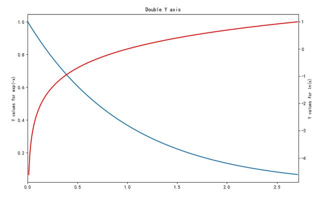
自動(dòng)生成一個(gè)例子
x = np.arange(0., np.e, 0.01)y1 = np.exp(-x)y2 = np.log(x)fig = plt.figure()ax1 = fig.add_subplot(111)ax1.plot(x, y1)ax1.set_ylabel(’Y values for exp(-x)’)ax1.set_title('Double Y axis')ax2 = ax1.twinx() # this is the important functionax2.plot(x, y2, ’r’)ax2.set_xlim([0, np.e])ax2.set_ylabel(’Y values for ln(x)’)ax2.set_xlabel(’Same X for both exp(-x) and ln(x)’)plt.show()
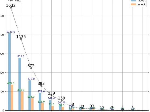
例子:畫了一個(gè)雙y軸坐標(biāo)的圖表
# -*- coding: utf-8 -*-#調(diào)用包import pandas as pd import numpy as np import matplotlib.pyplot as plt#讀取文件io=r’E:工作專項(xiàng)白騎士數(shù)據(jù)驗(yàn)證白騎士數(shù)據(jù)匯總表.xlsx’yinka=pd.read_excel(io,sheet_name=’YINKA_sample’)bqs=pd.read_excel(io,sheet_name=’BQS_result’)yinka_bqs=pd.merge(yinka,bqs,left_on=’no’,right_on=’no’,how=’inner’)#繪圖fig,ax=plt.subplots(1,1,figsize=(20, 300))ax.grid() #畫網(wǎng)格x=total.index-1 #為什么+1,因?yàn)閷?duì)不齊,所以使用時(shí)根據(jù)情況編寫y=total[’var1’]ax.plot(x,y,’k--o’,alpha=0.5) #畫折線圖ax.set_xlim([0,16]) #設(shè)置x軸的取值范圍 這個(gè)可以讓x軸與y軸的起點(diǎn)一致ax.set_xticks(np.arange(0,16)) #設(shè)置x軸的刻度范圍ax.set_xticklabels(np.arange(0,16),rotation=30) #設(shè)置x軸上的刻度ax.set_ylim([0,1800]) #同理y軸數(shù)值范圍ax.set_yticks(range(0,1800,300))#設(shè)置y軸的刻度范圍ax.set_yticklabels(range(0,1800,300))#設(shè)置y軸上的刻度ax.legend(loc=’upper left’) #設(shè)置ax子圖的圖例(legend)#新知識(shí)點(diǎn)for a,b in zip(x,y): #設(shè)置注釋 zip函數(shù)是對(duì)應(yīng)關(guān)系 ax.text(a,b,b,ha=’center’,va=’bottom’,fontsize=15)#重點(diǎn)ax1=ax.twinx() #這個(gè)是能夠?qū)崿F(xiàn)雙y軸的重點(diǎn),共享x軸;還有一種是雙x軸的圖表?yè)Q成ax.twiny()y1=total[[’adopt’,’reject’]]y1.plot.bar(ax=ax1,alpha=0.5) #這個(gè)是matplotlib中條形圖的繪制方法,如果使用seaborn繪制方法使用sns.barplot()函數(shù),需要調(diào)整很多細(xì)節(jié)#這里只設(shè)置了y軸的刻度,x軸的刻度設(shè)置了一下偶爾會(huì)出現(xiàn)失敗,值得注意的是要將數(shù)據(jù)對(duì)齊ax1.set_ylim([0,1800])ax1.set_yticks(range(0,1800,300))ax1.set_yticklabels(range(0,1800,300))for e,f,w in zip(data_.index,data_[0],data_[1]): ax1.text(e-1,f,f,ha=’center’,va=’bottom’,fontsize=10,color=’b’) ax1.text(e-1,w,w,ha=’center’,va=’bottom’,fontsize=10,color=’g’)ax1.legend(loc=’best’)plt.show() #養(yǎng)成習(xí)慣這個(gè)最好寫一下##保存圖片plt.savefig(’path’) #圖表輸出到本地
結(jié)果顯示:
總結(jié)
到此這篇關(guān)于Python matplotlib 繪制雙Y軸曲線圖的文章就介紹到這了,更多相關(guān)Python matplotlib 曲線圖內(nèi)容請(qǐng)搜索好吧啦網(wǎng)以前的文章或繼續(xù)瀏覽下面的相關(guān)文章希望大家以后多多支持好吧啦網(wǎng)!
相關(guān)文章:
1. Java GZip 基于內(nèi)存實(shí)現(xiàn)壓縮和解壓的方法2. Springboot 全局日期格式化處理的實(shí)現(xiàn)3. 利用CSS制作3D動(dòng)畫4. python 浮點(diǎn)數(shù)四舍五入需要注意的地方5. jsp+servlet簡(jiǎn)單實(shí)現(xiàn)上傳文件功能(保存目錄改進(jìn))6. PHP實(shí)現(xiàn)簡(jiǎn)單線性回歸之?dāng)?shù)學(xué)庫(kù)的重要性7. 完美解決vue 中多個(gè)echarts圖表自適應(yīng)的問題8. SpringBoot+TestNG單元測(cè)試的實(shí)現(xiàn)9. 存儲(chǔ)于xml中需要的HTML轉(zhuǎn)義代碼10. JAMon(Java Application Monitor)備忘記
 網(wǎng)公網(wǎng)安備