python matplotlib模塊基本圖形繪制方法小結【直線,曲線,直方圖,餅圖等】
本文實例講述了python matplotlib模塊基本圖形繪制方法。分享給大家供大家參考,具體如下:
matplotlib模塊是python中一個強大的繪圖模塊
安裝 pip install matplotlib
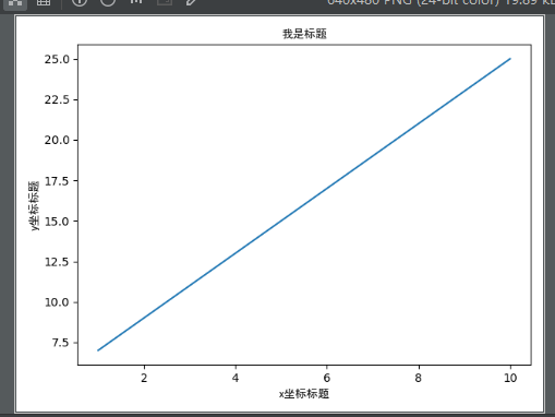
首先我們來畫一個簡單的圖來感受它的神奇
import numpy as npimport matplotlib.pyplot as pltimport matplotlibzhfont1=matplotlib.font_manager.FontProperties(fname='SimHei.ttf') #-------設置字體,這個可以事先下載https://www.fontpalace.com/font-details/SimHei/x=np.arange(1,11,1) #-------從數字1到11,步長為1y=2 * x +5plt.title('我是標題',fontproperties=zhfont1) #--------設置標題plt.xlabel('x坐標標題',fontproperties=zhfont1) #---------設置x坐標名稱plt.ylabel('y坐標標題',fontproperties=zhfont1) #---------設置y坐標名稱plt.plot(x,y) #---------開始繪制 plt.plot(x,y,':r') 表示使用虛線紅顏色繪制
plt.show() #---------顯示圖形
下面是簡單的圖形
2 一個圖片上繪制多個子圖:subplot
import numpy as npimport matplotlib.pyplot as pltimport matplotlibzhfont1=matplotlib.font_manager.FontProperties(fname='SimHei.ttf')# 計算正弦和余弦曲線上的點的 x 和 y 坐標x = np.arange(0, 3 * np.pi, 0.1)y_sin = np.sin(x)y_cos = np.cos(x)# 激活第一個 subplotplt.subplot(2, 2, 1)# 繪制第一個圖像plt.plot(x, y_sin)plt.title(’Sine-坐標圖1’,fontproperties=zhfont1)plt.xlabel(’x1’)plt.ylabel(’y1’)# 將第二個 subplot 激活,并繪制第二個圖像plt.subplot(2, 2, 2)plt.plot(x, y_cos)plt.title(’Cosine-坐標圖2’,fontproperties=zhfont1)plt.xlabel(’x2’)plt.ylabel(’y2’)# 展示圖像plt.show()
圖形如下
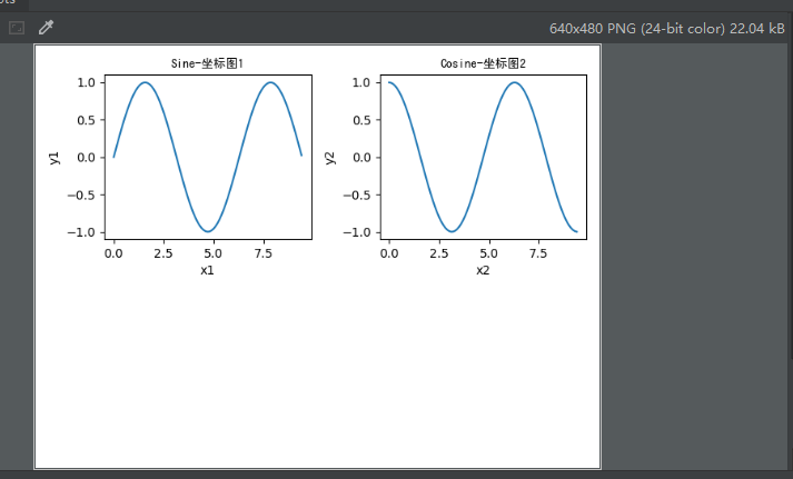
說明:從上圖我們可以看到出現了兩個子圖
plt.subplot用來激活子圖,plt.subplot(’x坐標分成幾個’,’y坐標分成幾個’,’本身是第幾個’): x*y就是把圖片分成幾個平等位置,最后的參數表示放在哪個位置,位置表示如下,從左到右,從上到下1 23 4如果要讓上面的圖對角表示呢,修改為
plt.subplot(2, 2, 1)
plt.subplot(2, 2, 4)
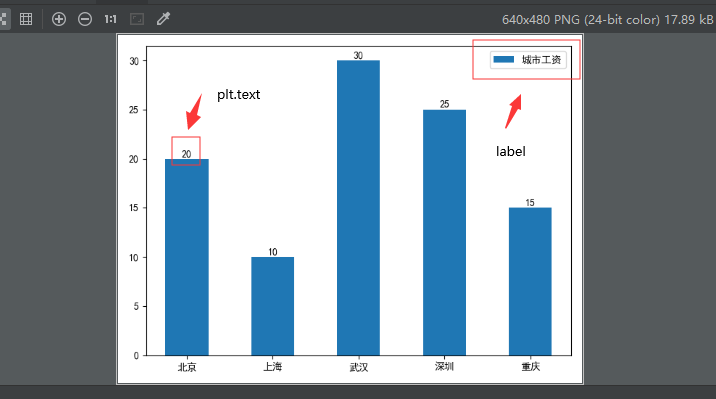
3 繪制直方圖
import numpy as npimport matplotlib.pyplot as pltimport matplotlib#zhfont1=matplotlib.font_manager.FontProperties(fname='SimHei.ttf')plt.rcParams[’font.family’]=’SimHei’x=[0,1,2,3,4]y=[20, 10, 30, 25, 15]str1 = ('北京', '上海', '武漢', '深圳', '重慶')plt.bar(x,height=y,width=0.5,label='城市工資',tick_label=str1) # tick_label要顯示的名稱# for a, b in zip(x, y):# plt.text(a, b + 0.05, ’%.0f’ % b, ha=’center’, va=’bottom’, fontsize=10)#分別按照坐標給出數據標簽plt.text(0,20+0.05,20,ha=’center’, va=’bottom’, fontsize=10) #簡單說(x位置,y位置+0.05,要顯示的數據,水平中心對齊,垂直底部對齊,字體大小)plt.text(1,10+0.05,10,ha=’center’, va=’bottom’, fontsize=10)plt.text(2,30+0.05,30,ha=’center’, va=’bottom’, fontsize=10)plt.text(3,25+0.05,25,ha=’center’, va=’bottom’, fontsize=10)plt.text(4,15+0.05,15,ha=’center’, va=’bottom’, fontsize=10)plt.legend() #用來顯示label標簽的內容plt.show()
下面顯示圖形
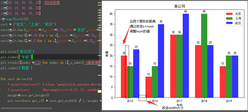
4 繪制條形圖(直方圖的一種)
import numpy as npimport matplotlib.pyplot as pltimport matplotlib#zhfont1=matplotlib.font_manager.FontProperties(fname='SimHei.ttf')plt.rcParams[’font.family’]=’SimHei’x_label=[’2015’, ’2016’, ’2017’,’2018’,’2019’] #橫坐標刻度顯示y1=[20, 10, 30, 25, 15] #縱坐標值y2=[15, 15, 30, 40, 20]y3=[23, 35, 40, 25, 20]x=range(len(y1))str1 = ('北京', '上海', '武漢')#調整x和height的大小可以改變條形圖的間距和兩個年份的圖形間距rect1=plt.bar(x,height=y1,width=0.25,label='北京',color=’red’,alpha=0.8)rect2=plt.bar([i+0.25 for i in x],height=y2,width=0.25,label='上海',color=’green’,alpha=0.8)rect3=plt.bar([i+0.5 for i in x],height=y3,width=0.25,label='武漢',color=’blue’,alpha=0.8)plt.title(’某公司’)plt.xlabel(’年份’)plt.xticks([index +0.25 for index in x],x_label) #直接調整了x刻度名稱的位置plt.ylabel(’數量’)for rect in rect1: #設置顯示數據內容 # print(type(rect)) #<class ’matplotlib.patches.Rectangle’> # print(rect) #Rectangle(xy=(-0.15, 0), width=0.3, height=20, angle=0) height=rect.get_height() plt.text(rect.get_x() + rect.get_width() / 2, height + 0.5, str(height), ha='center', va='bottom')for rect in rect2: height=rect.get_height() plt.text(rect.get_x() + rect.get_width() / 2, height + 0.5, str(height), ha='center', va='bottom')for rect in rect3: height=rect.get_height() plt.text(rect.get_x() + rect.get_width() / 2, height + 0.5, str(height), ha='center', va='bottom')plt.legend()plt.show()
結果看下圖
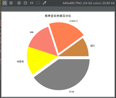
5 餅圖繪制
import matplotlib.pyplot as pltimport matplotlibplt.rcParams[’font.sans-serif’]=[’SimHei’]#將圖表內容字體設置為黑體,可以正常顯示中文ratios=[0.1,0.2,0.15,0.15,0.4]#存放比例列表,相加等于1colors=[’peru’,’coral’,’salmon’,’yellow’,’grey’]#存放顏色列表,與比例相匹配labels=['流行',’classic’,’pop’,’純音樂’,’blue’]#存放各類元素標簽explode=(0,0.1,0,0,0.1) #大于0的表示突出的比例,負值表示往里縮plt.pie(ratios,explode=explode,colors=colors,labels=labels)#繪制餅圖 (比例列表,突出列表,顏色列表,標簽列表)plt.title(’歌單音樂種類百分比’)plt.axis(’equal’)#將餅圖顯示為正圓形plt.show()
圖形如下:
最后,此篇博客總結
1 字體可以使用自己下載的 zhfont1=matplotlib.font_manager.FontProperties(fname='SimHei.ttf') 也可以使用系統的 plt.rcParams[’font.family’]=’SimHei’2 三要素,標題:plt.title x座標 plt.xlabel y坐標 plt.ylabel3 繪制子圖使用 plt.subplot4 繪制數據標簽:plt.text5 圖形顯示 plt.show()6 最后沒說的 plt.savefig(’路徑/名稱.png’)7 想讓x坐標的文字傾斜45度: plt.xticks(rotation=45)
更多關于Python相關內容感興趣的讀者可查看本站專題:《Python數學運算技巧總結》、《Python數據結構與算法教程》、《Python函數使用技巧總結》、《Python字符串操作技巧匯總》及《Python入門與進階經典教程》
希望本文所述對大家Python程序設計有所幫助。
相關文章:

 網公網安備
網公網安備