Android 側(cè)滑抽屜菜單的實(shí)現(xiàn)代碼
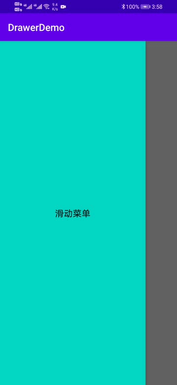
運(yùn)行效果圖:
滑動(dòng)菜單相信都不會(huì)陌生,你可能見過很多這樣的文章,但我的文章會(huì)給你不一樣的閱讀和操作體驗(yàn)。
正文寫博客,自然是從創(chuàng)建項(xiàng)目開始了,這樣你可以更好的知道這個(gè)過程中經(jīng)歷了什么。
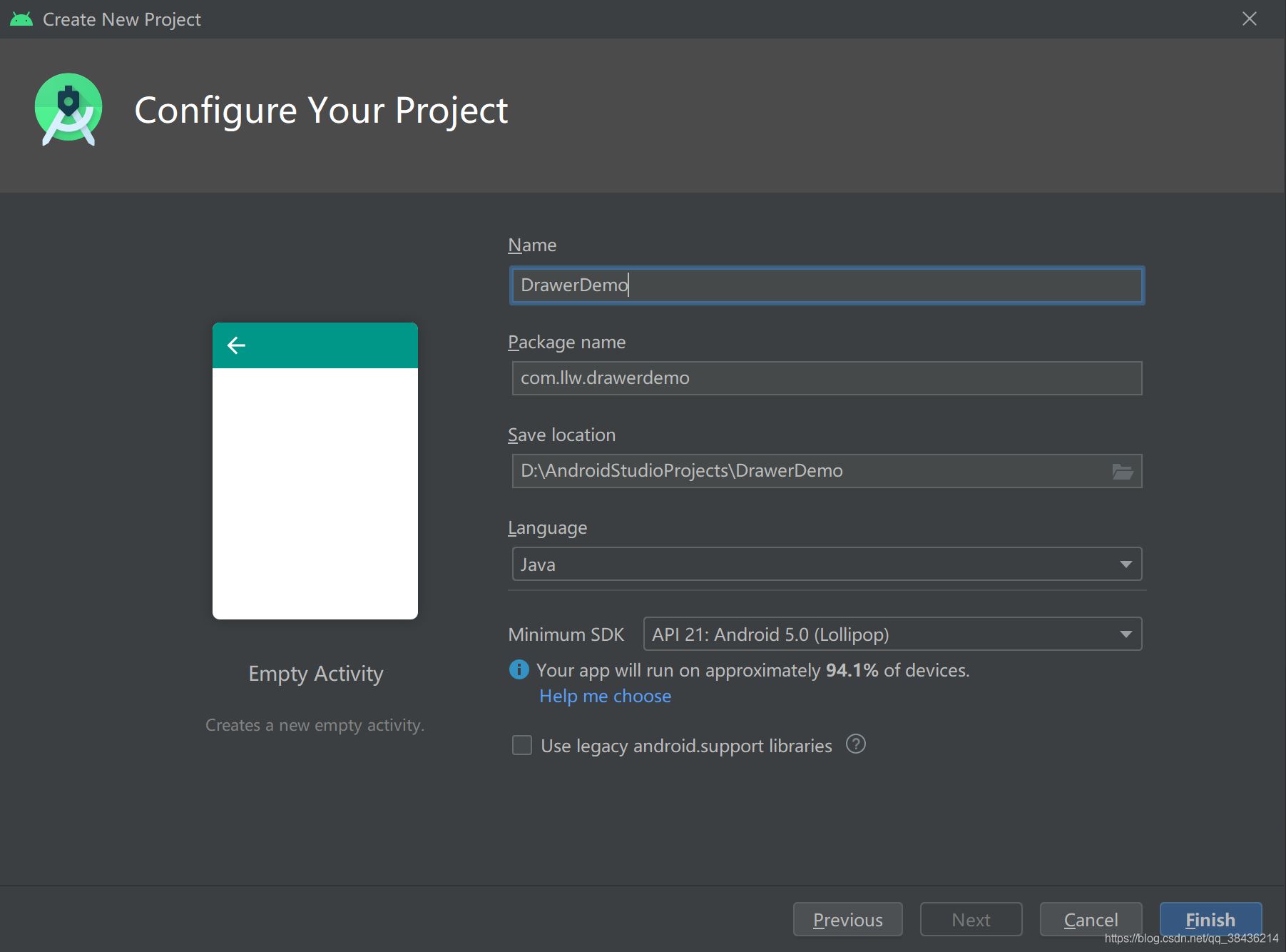
一、創(chuàng)建項(xiàng)目項(xiàng)目就命名為DrawerDemo,
絕對(duì)的手把手教學(xué),讓你清楚每一步怎么做。
然后打開app下的build.gradle,在android{}閉包中添加如下代碼:
//配置JDK的版本 compileOptions { targetCompatibility JavaVersion.VERSION_1_8 sourceCompatibility JavaVersion.VERSION_1_8 }
這里是配置JDK的版本,為1.8,我個(gè)人最喜歡的版本。一旦項(xiàng)目中的build.gradle有改動(dòng),便會(huì)出現(xiàn)Sync Now或者Sync的同步提示,如下圖所示:
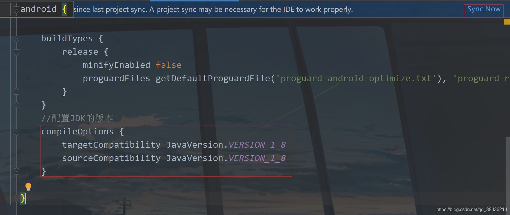
右上角的就是這個(gè)同步提示,如果你不點(diǎn)擊進(jìn)行同步,則你剛才在build.gradle中的改動(dòng)無效,下面點(diǎn)擊Sync Now。
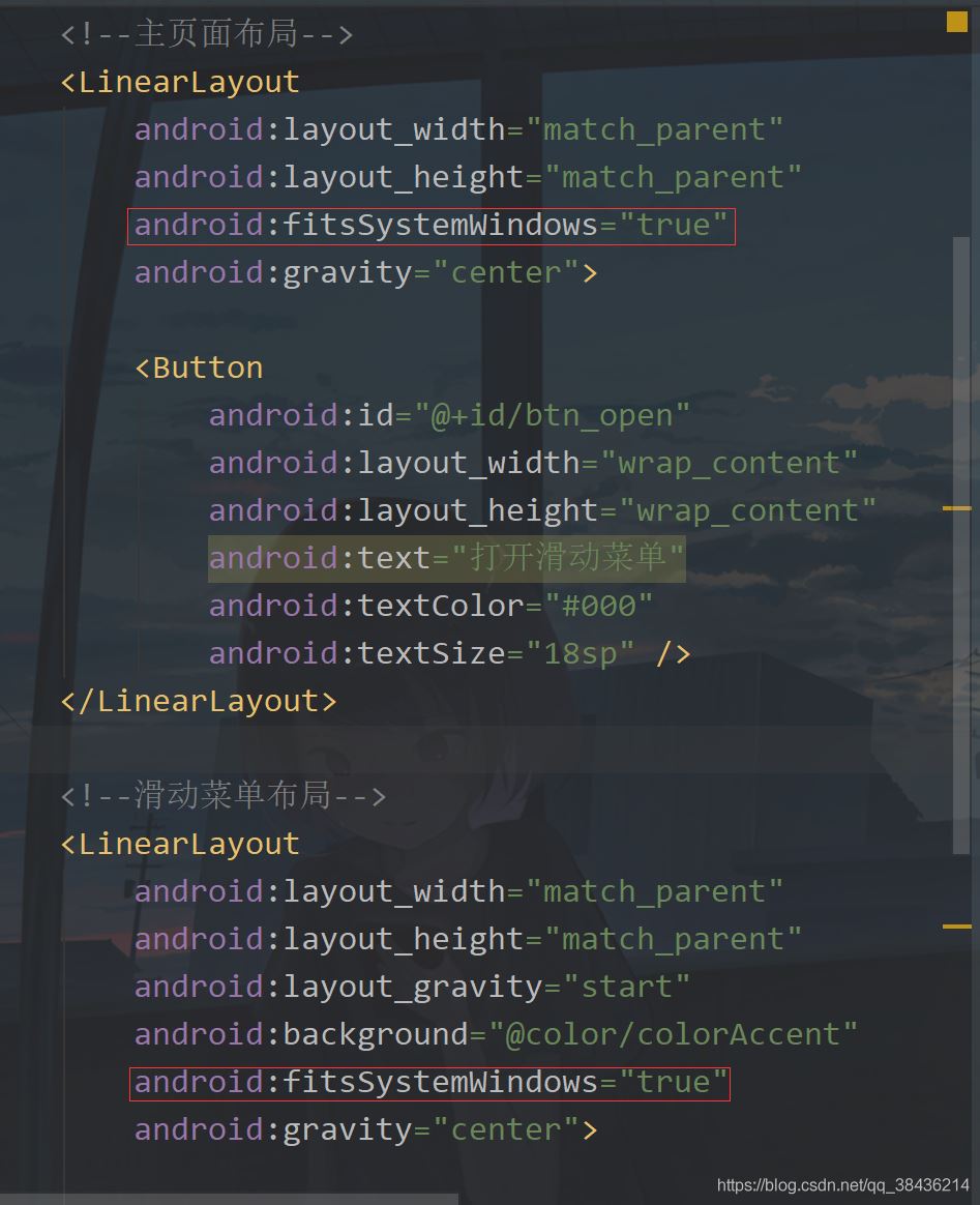
二、添加滑動(dòng)菜單打開layout,找到activity_main.xml,修改代碼后如下所示:
<?xml version='1.0' encoding='utf-8'?><androidx.drawerlayout.widget.DrawerLayout xmlns:android='http://schemas.android.com/apk/res/android' xmlns:tools='http://schemas.android.com/tools' android: android:layout_width='match_parent' android:layout_height='match_parent' tools:context='.MainActivity'> <!--主頁面布局--> <LinearLayout android:layout_width='match_parent' android:layout_height='match_parent' android:gravity='center'> <Button android: android:layout_width='wrap_content' android:layout_height='wrap_content' android:text='打開滑動(dòng)菜單' android:textColor='#000' android:textSize='18sp' /> </LinearLayout> <!--滑動(dòng)菜單布局--> <LinearLayout android:layout_width='match_parent' android:layout_height='match_parent' android:layout_gravity='start' android:background='@color/colorAccent' android:gravity='center'> <TextView android:layout_width='wrap_content' android:layout_height='wrap_content' android:text='滑動(dòng)菜單' android:textColor='#000' android:textSize='18sp' /> </LinearLayout></androidx.drawerlayout.widget.DrawerLayout>
這里你可以選擇復(fù)制粘貼到你的項(xiàng)目中,然后來說說這里的細(xì)節(jié)。
第一個(gè)細(xì)節(jié)就是頁面根布局,DrawerLayout ,這個(gè)布局現(xiàn)在是在androidx下的,如果你還是v4或者v7的版本下的,請(qǐng)盡早遷移到androidx,至于怎么遷移?你更新Android Studio就可以了,目前最新的AS是4.1.3版本,你可以選擇4.0.1就可以了,穩(wěn)妥。
然后你注意到這個(gè)里面放了兩個(gè)LinearLayout(線性布局),LinearLayout里面一個(gè)放了TextView,一個(gè)放了Button,居中顯示,我這里特地在布局中增加了注釋,告訴你哪一個(gè)是主頁面,哪一個(gè)是滑動(dòng)菜單。
那么是怎么分出來的呢?當(dāng)你第一次看的時(shí)候你不知道為什么的時(shí)候,你就找不同,看看兩個(gè)LinearLayout有什么不同,于是你會(huì)發(fā)現(xiàn)滑動(dòng)菜單比主頁面布局多了兩個(gè)屬性
android:layout_gravity='start' android:background='@color/colorAccent'
然后結(jié)果很明顯了,background只能修改布局的布景,那么答案就是
android:layout_gravity='start'
這個(gè)屬性是什么意思呢?layout_gravity值的是布局重力,這里你要和gravity區(qū)分出來,你記住有l(wèi)ayout的代表控制本身,沒有l(wèi)ayout的代表控制內(nèi)容。而它的屬性值你看到是start,這種屬性一般都是成對(duì)關(guān)系,有start自然就有end。而start是Android中新的用法,它代替了left,end代替了right。現(xiàn)在的left和right依然可以用,只不過Google更推薦你使用start和end表示左右。
那么你現(xiàn)在再來看這一行代碼就知道是什么意思了。就是當(dāng)前布局置于根布局的左側(cè),而因?yàn)槟愕母季质荄rawerLayout,因此你的預(yù)覽界面應(yīng)該只能看到頁面主布局。
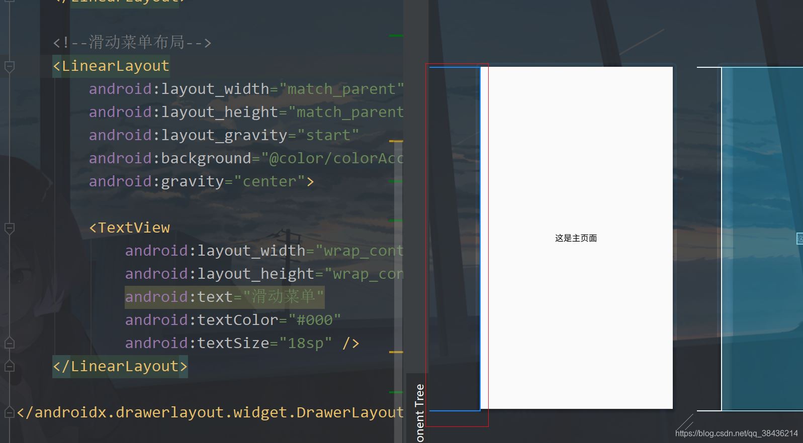
但是你要注意左邊的這個(gè)藍(lán)色線,這個(gè)代表了你當(dāng)前的滑動(dòng)菜單的位置。此時(shí)你把start改成end,你再看預(yù)覽界面就到了右邊去了,表示從屏幕右側(cè)出現(xiàn)。記得改回start。
布局介紹完畢了,下面我們通過點(diǎn)擊主頁面的按鈕顯示這個(gè)滑動(dòng)菜單。
打開MainActivity,修改后代碼如下:
public class MainActivity extends AppCompatActivity { private DrawerLayout drawerLayout;//滑動(dòng)菜單 @Override protected void onCreate(Bundle savedInstanceState) { super.onCreate(savedInstanceState); setContentView(R.layout.activity_main); drawerLayout = findViewById(R.id.drawer_layout); findViewById(R.id.btn_open).setOnClickListener(v -> { //打開滑動(dòng)菜單 左側(cè)出現(xiàn) drawerLayout.openDrawer(GravityCompat.START); }); }}
這里我創(chuàng)建一個(gè)變量,然后在onCreate中綁定布局id。然后在按鈕的點(diǎn)擊事件中,通過openDrawer方法打開滑動(dòng)菜單,里面?zhèn)魅隚ravityCompat.START,START是左側(cè),GravityCompat是重力兼容,表示兼容低版本,在低版本的AS中你就要使用Gravity.START。
這里的START和布局中的start是要對(duì)應(yīng)上的,如果你不對(duì)應(yīng)上就會(huì)報(bào)錯(cuò),那么下面運(yùn)行一下吧。
嗯,這個(gè)效果是有了,但是感覺比較的丑,那么來美化一下吧。
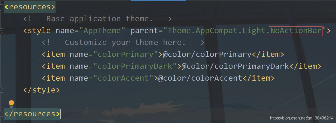
三、UI美化打開res下values文件夾中的styles.xml。把DarkActionBar改成NoActionBar,意思是去掉默認(rèn)的導(dǎo)航欄。
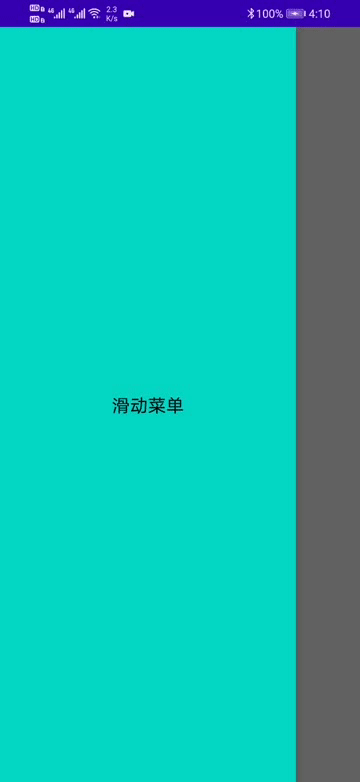
然后你再運(yùn)行一下,你會(huì)發(fā)現(xiàn)好看了一點(diǎn)點(diǎn)。
不過屏幕頂部還是有那個(gè)很丑的狀態(tài)欄,因此我們還需要美化一下。
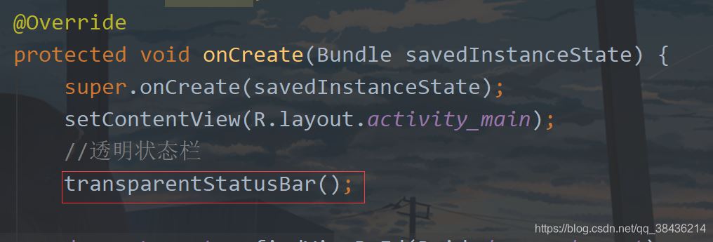
在MainActivity中增加一個(gè)方法來設(shè)置狀態(tài)欄透明。
/** * 透明狀態(tài)欄 */ private void transparentStatusBar() { //改變狀態(tài)欄顏色為透明 View decorView = getWindow().getDecorView(); decorView.setSystemUiVisibility(View.SYSTEM_UI_FLAG_LAYOUT_FULLSCREEN | View.SYSTEM_UI_FLAG_LAYOUT_STABLE); getWindow().setStatusBarColor(Color.TRANSPARENT); }
這個(gè)方法先拿到當(dāng)前Actvity的DecorView,它是Activity的根部視圖,相當(dāng)于最底層的視圖,你想要詳細(xì)的了解就需要去看源碼了。然后調(diào)用setSystemUiVisibility來改變系統(tǒng)UI的顯示。View.SYSTEM_UI_FLAG_LAYOUT_FULLSCREEN和View.SYSTEM_UI_FLAG_LAYOUT_STABLE表示Activity的布局會(huì)顯示在狀態(tài)欄上面,之后調(diào)用setStatusBarColor方法設(shè)置狀態(tài)欄顏色為透明。
然后在onCreate中調(diào)用這個(gè)方法。
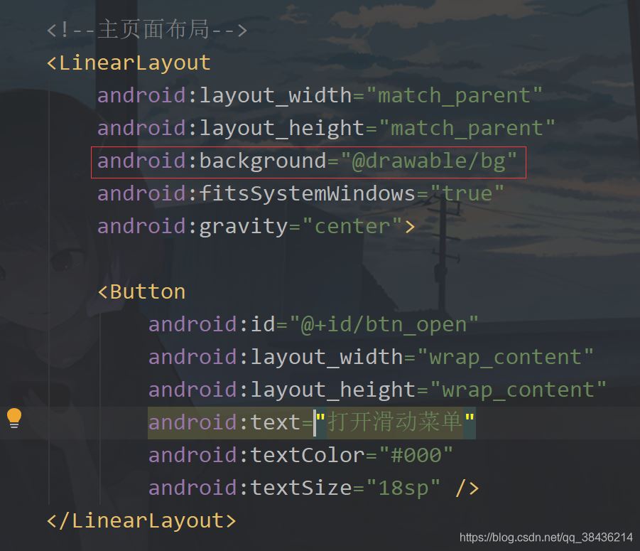
然后你還需要在activity_main.xml中去設(shè)置可以顯示需要顯示在狀態(tài)欄中的布局。在主頁面布局和滑動(dòng)菜單的父布局中都添加一個(gè)屬性:
android:fitsSystemWindows='true'
然后再給主頁面設(shè)置一個(gè)背景圖,背景圖如下:

放到你項(xiàng)目的drawable文件夾下,然后在布局中設(shè)置
下面運(yùn)行一下:
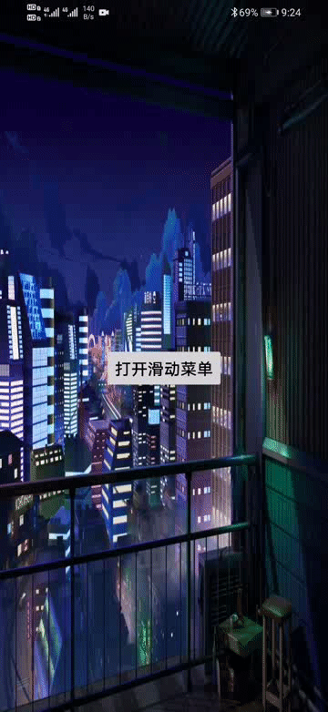
現(xiàn)在這個(gè)感覺怎么樣呢?比之前是不是好多了呢?但是你會(huì)發(fā)現(xiàn)這個(gè)按鈕有一些不上檔次了,顯得是辣么的突兀。我們像個(gè)辦法去掉它。
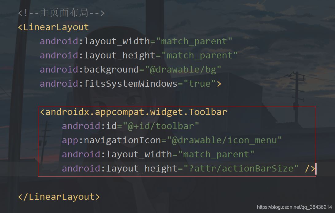
首先修改布局,將之前的按鈕替換為如下代碼:
<androidx.appcompat.widget.Toolbar android: app:navigationIcon='@drawable/icon_menu' android:layout_width='match_parent' android:layout_height='?attr/actionBarSize' />
添加位置如下圖
這里的icon_menu是一個(gè)圖標(biāo),在你的drawable下新建一個(gè)icon_menu.xml文件,里面的代碼如下:
<?xml version='1.0' encoding='UTF-8'?><vector xmlns:android='http://schemas.android.com/apk/res/android' android: android: android:tint='#FFFFFF' android:viewportWidth='24.0' android:viewportHeight='24.0'> <path android:fillColor='@android:color/white' android:pathData='M4,18h16c0.55,0 1,-0.45 1,-1l0,0c0,-0.55 -0.45,-1 -1,-1H4c-0.55,0 -1,0.45 -1,1l0,0C3,17.55 3.45,18 4,18zM4,13h16c0.55,0 1,-0.45 1,-1l0,0c0,-0.55 -0.45,-1 -1,-1H4c-0.55,0 -1,0.45 -1,1l0,0C3,12.55 3.45,13 4,13zM3,7L3,7c0,0.55 0.45,1 1,1h16c0.55,0 1,-0.45 1,-1l0,0c0,-0.55 -0.45,-1 -1,-1H4C3.45,6 3,6.45 3,7z' /></vector>
這是一個(gè)白色的菜單圖標(biāo),下面回到MainActivity中,先聲明變量。
private DrawerLayout drawerLayout;//滑動(dòng)菜單
然后在onCreate中添加如下代碼:
toolbar = findViewById(R.id.toolbar); //工具欄按鈕點(diǎn)擊 toolbar.setNavigationOnClickListener(v -> drawerLayout.openDrawer(GravityCompat.START));
點(diǎn)擊之后打開這個(gè)滑動(dòng)菜單。
下面你再運(yùn)行一下:

這樣就簡(jiǎn)潔雅致了很多了。
四、添加導(dǎo)航視圖現(xiàn)在我們的滑動(dòng)菜單用的是一個(gè)LinearLayout,雖然用起來沒有很大的問題,但是如果有更好的控件為什么不用呢?下面就來介紹一下NavigationView,不過要在AS中使用這個(gè)控件還需要添加一個(gè)依賴庫:
打開你app下的build.gradle,在dependencies{}閉包中添加如下依賴
//添加material庫 implementation ’com.google.android.material:material:1.2.1’
添加之后記得點(diǎn)擊Sync Now進(jìn)行同步項(xiàng)目。
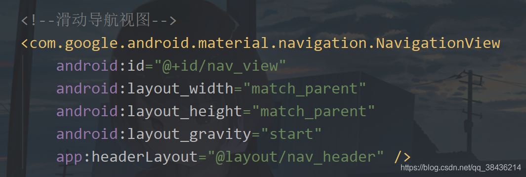
然后修改activity_main.xml,去掉之前的滑動(dòng)菜單,修改的頁面布局代碼如下:
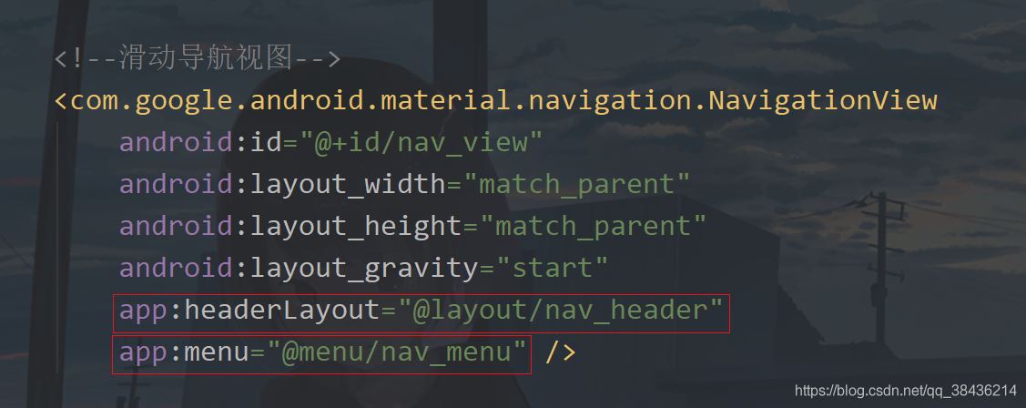
<?xml version='1.0' encoding='utf-8'?><androidx.drawerlayout.widget.DrawerLayout xmlns:android='http://schemas.android.com/apk/res/android' xmlns:app='http://schemas.android.com/apk/res-auto' xmlns:tools='http://schemas.android.com/tools' android: android:layout_width='match_parent' android:layout_height='match_parent' tools:context='.MainActivity'> <!--主頁面布局--> <LinearLayout android:layout_width='match_parent' android:layout_height='match_parent' android:background='@drawable/bg' android:fitsSystemWindows='true'> <androidx.appcompat.widget.Toolbar android: android:layout_width='match_parent' android:layout_height='?attr/actionBarSize' app:navigationIcon='@drawable/icon_menu' /> </LinearLayout> <!--滑動(dòng)導(dǎo)航視圖--> <com.google.android.material.navigation.NavigationView android: android:layout_width='match_parent' android:layout_height='match_parent' android:layout_gravity='start' /></androidx.drawerlayout.widget.DrawerLayout>
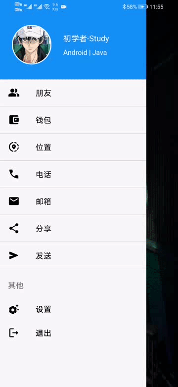
不過就算是這樣,你當(dāng)前還需要添加導(dǎo)航視圖的頭部視圖和菜單視圖。在layout下新建一個(gè)nav_header.xml,作為導(dǎo)航的頭部視圖,常規(guī)的我們會(huì)在導(dǎo)航視圖里面放置一些個(gè)人信息,頭像,名稱等。
那么頭像是一個(gè)圖片,而且普遍是圓形圖片,常規(guī)是通過一些第三方庫和自定義VIew來實(shí)現(xiàn)。還記得我們剛才導(dǎo)入的material庫嗎?可以用它里面的控件來實(shí)現(xiàn)圓形頭像。
首先我們?cè)趕tyles.xml中增加如下代碼:
<!-- 圓形圖片 --> <style name='circleImageStyle'> <item name='cornerFamily'>rounded</item> <item name='cornerSize'>50%</item> </style>
然后在nav_header.xml增加一個(gè)圖標(biāo)控件和兩個(gè)文字控件,里面代碼如下:
<?xml version='1.0' encoding='utf-8'?><RelativeLayout xmlns:android='http://schemas.android.com/apk/res/android' xmlns:app='http://schemas.android.com/apk/res-auto' android:layout_width='match_parent' android:layout_height='160dp' android:background='#1391F8' android:fitsSystemWindows='true' android:orientation='vertical'> <!--頭像--> <com.google.android.material.imageview.ShapeableImageView android: android:layout_width='80dp' android:layout_height='80dp' android:layout_alignParentBottom='true' android:layout_marginStart='24dp' android:layout_marginBottom='30dp' android:padding='1dp' android:layout_marginEnd='24dp' android:src='http://m.4tl426be.cn/bcjs/@mipmap/icon_default_avatar' app:shapeAppearanceOverlay='@style/circleImageStyle' app:strokeColor='#FFF' app:strokeWidth='2dp' /> <!--名稱--> <TextView android:layout_marginTop='16dp' android:layout_alignTop='@+id/iv_avatar' android: android:textSize='16sp' android:textColor='#FFF' android:layout_width='wrap_content' android:layout_height='wrap_content' android:layout_toEndOf='@+id/iv_avatar' android:text='初學(xué)者-Study' /> <!--標(biāo)簽--> <TextView android:layout_marginTop='8dp' android: android:textSize='14sp' android:layout_below='@+id/tv_name' android:textColor='#FFF' android:layout_width='wrap_content' android:layout_height='wrap_content' android:layout_toEndOf='@+id/iv_avatar' android:text='Android | Java' /></RelativeLayout>
這里有一個(gè)icon_default_avatar的圖標(biāo),也是我博客的頭像,如下圖所示

那么這個(gè)導(dǎo)航視圖的頭部就寫好了,下面來寫導(dǎo)航菜單。
在這之前能先放置五個(gè)圖標(biāo),都是通過路徑來繪制的。都放在drawable下。icon_friend.xml
<?xml version='1.0' encoding='UTF-8'?><vector xmlns:android='http://schemas.android.com/apk/res/android' android: android: android:tint='#000000' android:viewportWidth='24.0' android:viewportHeight='24.0'> <path android:fillColor='@android:color/black' android:pathData='M15,8c0,-1.42 -0.5,-2.73 -1.33,-3.76C14.09,4.1 14.53,4 15,4c2.21,0 4,1.79 4,4s-1.79,4 -4,4c-0.43,0 -0.84,-0.09 -1.23,-0.21c-0.03,-0.01 -0.06,-0.02 -0.1,-0.03C14.5,10.73 15,9.42 15,8zM16.66,13.13C18.03,14.06 19,15.32 19,17v3h4v-3C23,14.82 19.42,13.53 16.66,13.13zM9,4c2.21,0 4,1.79 4,4s-1.79,4 -4,4s-4,-1.79 -4,-4S6.79,4 9,4zM9,13c2.67,0 8,1.34 8,4v3H1v-3C1,14.34 6.33,13 9,13z' /></vector>
icon_wallet.xml
<?xml version='1.0' encoding='UTF-8'?><vector xmlns:android='http://schemas.android.com/apk/res/android' android: android: android:tint='#000000' android:viewportWidth='24.0' android:viewportHeight='24.0'> <path android:fillColor='@android:color/black' android:pathData='M10,16V8c0,-1.1 0.89,-2 2,-2h9V5c0,-1.1 -0.9,-2 -2,-2H5C3.89,3 3,3.9 3,5v14c0,1.1 0.89,2 2,2h14c1.1,0 2,-0.9 2,-2v-1h-9C10.89,18 10,17.1 10,16zM13,8c-0.55,0 -1,0.45 -1,1v6c0,0.55 0.45,1 1,1h8c0.55,0 1,-0.45 1,-1V9c0,-0.55 -0.45,-1 -1,-1H13zM16,13.5c-0.83,0 -1.5,-0.67 -1.5,-1.5s0.67,-1.5 1.5,-1.5s1.5,0.67 1.5,1.5S16.83,13.5 16,13.5z' /></vector>
icon_location.xml
<?xml version='1.0' encoding='UTF-8'?><vector xmlns:android='http://schemas.android.com/apk/res/android' android: android: android:tint='#000000' android:viewportWidth='24.0' android:viewportHeight='24.0'> <path android:fillColor='@android:color/black' android:pathData='M13.02,20.77L13.02,20.77c0,0.64 0.59,1.13 1.21,0.99c1.12,-0.26 2.18,-0.7 3.12,-1.3c0.53,-0.34 0.61,-1.1 0.16,-1.55l0,0c-0.32,-0.32 -0.83,-0.4 -1.21,-0.16c-0.77,0.49 -1.62,0.85 -2.53,1.05C13.32,19.9 13.02,20.31 13.02,20.77z' /> <path android:fillColor='@android:color/black' android:pathData='M4.03,12c0,-3.79 2.65,-6.97 6.2,-7.79c0.44,-0.1 0.75,-0.51 0.75,-0.96v0c0,-0.64 -0.6,-1.13 -1.22,-0.98C5.33,3.29 2.03,7.26 2.03,12c0,4.74 3.3,8.71 7.73,9.74c0.62,0.15 1.22,-0.34 1.22,-0.98v0c0,-0.46 -0.31,-0.86 -0.75,-0.96C6.68,18.97 4.03,15.79 4.03,12z' /> <path android:fillColor='@android:color/black' android:pathData='M20.79,11L20.79,11c0.64,0 1.13,-0.59 0.99,-1.21c-0.26,-1.12 -0.7,-2.17 -1.3,-3.12c-0.34,-0.54 -1.1,-0.61 -1.55,-0.16l0,0c-0.32,0.32 -0.4,0.83 -0.15,1.21c0.49,0.76 0.85,1.61 1.05,2.53C19.92,10.7 20.33,11 20.79,11z' /> <path android:fillColor='@android:color/black' android:pathData='M17.35,3.55c-0.95,-0.6 -2,-1.04 -3.12,-1.3c-0.62,-0.14 -1.21,0.35 -1.21,0.98v0c0,0.45 0.3,0.87 0.74,0.96c0.91,0.2 1.77,0.57 2.53,1.05c0.39,0.24 0.89,0.17 1.21,-0.16l0,0C17.96,4.64 17.89,3.89 17.35,3.55z' /> <path android:fillColor='@android:color/black' android:pathData='M18.92,17.49L18.92,17.49c0.45,0.45 1.21,0.38 1.55,-0.16c0.6,-0.94 1.04,-2 1.3,-3.12c0.14,-0.62 -0.35,-1.21 -0.98,-1.21h0c-0.45,0 -0.87,0.3 -0.96,0.74c-0.2,0.91 -0.57,1.77 -1.05,2.53C18.52,16.66 18.6,17.17 18.92,17.49z' /> <path android:fillColor='@android:color/black' android:pathData='M16,11.1C16,8.61 14.1,7 12,7s-4,1.61 -4,4.1c0,1.51 1.1,3.28 3.31,5.3c0.39,0.36 0.98,0.36 1.38,0C14.9,14.37 16,12.61 16,11.1zM12,12c-0.59,0 -1.07,-0.48 -1.07,-1.07c0,-0.59 0.48,-1.07 1.07,-1.07s1.07,0.48 1.07,1.07C13.07,11.52 12.59,12 12,12z' /></vector>
icon_phone.xml
<?xml version='1.0' encoding='UTF-8'?><vector xmlns:android='http://schemas.android.com/apk/res/android' android: android:tint='#000000' android:viewportHeight='24.0' android:viewportWidth='24.0' android:width='24dp'> <path android:fillColor='@android:color/white' android:pathData='M15.63,14.4l-2.52,2.5c-2.5,-1.43 -4.57,-3.5 -6,-6l2.5,-2.52c0.23,-0.24 0.33,-0.57 0.27,-0.9L9.13,3.8C9.04,3.34 8.63,3 8.15,3L4,3C3.44,3 2.97,3.47 3,4.03C3.17,6.92 4.05,9.63 5.43,12c1.58,2.73 3.85,4.99 6.57,6.57c2.37,1.37 5.08,2.26 7.97,2.43c0.56,0.03 1.03,-0.44 1.03,-1l0,-4.15c0,-0.48 -0.34,-0.89 -0.8,-0.98l-3.67,-0.73C16.2,14.07 15.86,14.17 15.63,14.4z'/></vector>
icon_email.xml
<?xml version='1.0' encoding='UTF-8'?><vector xmlns:android='http://schemas.android.com/apk/res/android' android: android:tint='#000000' android:viewportHeight='24.0' android:viewportWidth='24.0' android:width='24dp'> <path android:fillColor='@android:color/white' android:pathData='M20,4H4C2.9,4 2.01,4.9 2.01,6L2,18c0,1.1 0.9,2 2,2h16c1.1,0 2,-0.9 2,-2V6C22,4.9 21.1,4 20,4zM19.6,8.25l-7.07,4.42c-0.32,0.2 -0.74,0.2 -1.06,0L4.4,8.25C4.15,8.09 4,7.82 4,7.53c0,-0.67 0.73,-1.07 1.3,-0.72L12,11l6.7,-4.19C19.27,6.46 20,6.86 20,7.53C20,7.82 19.85,8.09 19.6,8.25z'/></vector>
然后我們?cè)趓es下新建一個(gè)menu文件夾,文件夾下新建一個(gè)nav_menu.xml文件。里面的代碼如下:
<?xml version='1.0' encoding='utf-8'?><menu xmlns:android='http://schemas.android.com/apk/res/android'> <group android:checkableBehavior='single'> <item android: android:icon='@drawable/icon_friend' android:title='朋友' /> <item android: android:icon='@drawable/icon_wallet' android:title='錢包' /> <item android: android:icon='@drawable/icon_location' android:title='位置' /> <item android: android:icon='@drawable/icon_phone' android:title='電話' /> <item android: android:icon='@drawable/icon_email' android:title='郵箱' /> </group></menu>
此時(shí)你會(huì)在預(yù)覽的地方看到這樣的畫面
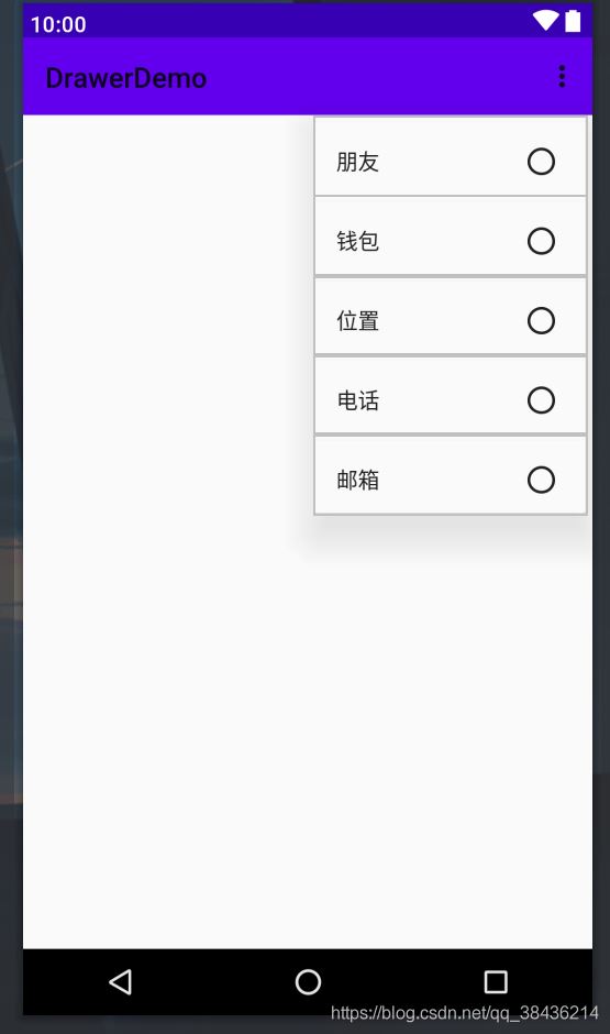
不用擔(dān)心,圖標(biāo)是有的,只不過和使用方式有關(guān)系。
下面我們回到這個(gè)activity_main.xml,把我們寫的導(dǎo)頭部和菜單都引入進(jìn)NavigationView中。
運(yùn)行一下吧。

這樣的效果如何呢?當(dāng)然我們還需要與用戶交互才行,不然你就是中看不中用。
進(jìn)入到MainActivity中,首先新建一個(gè)showMsg方法,用于彈出Toast提示。
/** * Toast提示 * @param msg 內(nèi)容 */ private void showMsg(String msg){ Toast.makeText(this,msg,Toast.LENGTH_SHORT).show(); }
然后新增變量:
private NavigationView navView;//導(dǎo)航視圖
然后在onCreate中綁定xml的id。
navView = findViewById(R.id.nav_view);
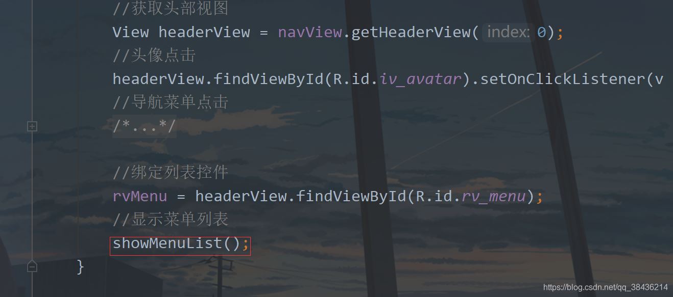
再通過這個(gè)navView來獲取頭部視圖。
//獲取頭部視圖 View headerView = navView.getHeaderView(0);
頭部視圖中常規(guī)的頭像是有點(diǎn)擊動(dòng)作的了,那么可以這樣寫:
//頭像點(diǎn)擊 headerView.findViewById(R.id.iv_avatar).setOnClickListener(v -> showMsg('頭像'));
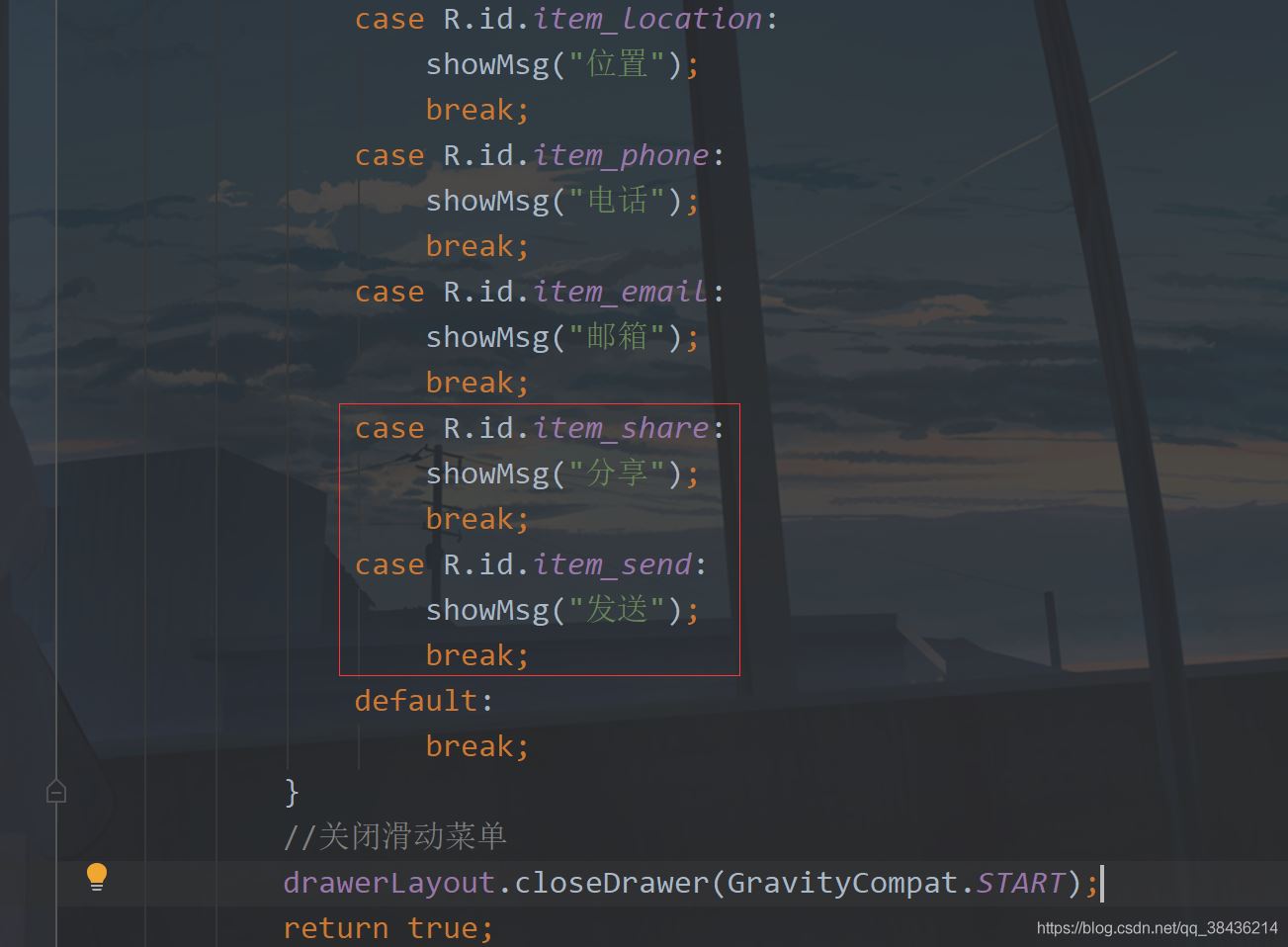
然后就是菜單視圖的點(diǎn)擊了,如下所示,通過點(diǎn)擊item的id進(jìn)行判斷,然后提示,之后關(guān)閉滑動(dòng)菜單。
//導(dǎo)航菜單點(diǎn)擊 navView.setNavigationItemSelectedListener(item -> { switch (item.getItemId()) { case R.id.item_friend: showMsg('朋友'); break; case R.id.item_wallet: showMsg('錢包'); break; case R.id.item_location: showMsg('位置'); break; case R.id.item_phone: showMsg('電話'); break; case R.id.item_email: showMsg('郵箱'); break; default: break; } //關(guān)閉滑動(dòng)菜單 drawerLayout.closeDrawer(GravityCompat.START); return true; });
運(yùn)行之后一一點(diǎn)擊測(cè)試一下:

嗯,和預(yù)想的效果一致,這也是現(xiàn)在很多APP側(cè)滑菜單的用法,基本上就差不多了。
五、菜單分類假如上面的五個(gè)菜單是基礎(chǔ)功能,那么下面再添加一個(gè)擴(kuò)展菜單。當(dāng)然還是要先添加這個(gè)菜單圖標(biāo)icon_share.xml
<?xml version='1.0' encoding='UTF-8'?><vector xmlns:android='http://schemas.android.com/apk/res/android' android: android: android:tint='#000000' android:viewportWidth='24.0' android:viewportHeight='24.0'> <path android:fillColor='@android:color/white' android:pathData='M18,16c-0.79,0 -1.5,0.31 -2.03,0.81L8.91,12.7C8.96,12.47 9,12.24 9,12s-0.04,-0.47 -0.09,-0.7l7.05,-4.11C16.49,7.69 17.21,8 18,8c1.66,0 3,-1.34 3,-3s-1.34,-3 -3,-3s-3,1.34 -3,3c0,0.24 0.04,0.48 0.09,0.7L8.04,9.81C7.5,9.31 6.79,9 6,9c-1.66,0 -3,1.34 -3,3s1.34,3 3,3c0.79,0 1.5,-0.31 2.04,-0.81l7.05,4.12C15.04,18.53 15,18.76 15,19c0,1.66 1.34,3 3,3s3,-1.34 3,-3S19.66,16 18,16z' /></vector>
icon_send.xml
<?xml version='1.0' encoding='UTF-8'?><vector xmlns:android='http://schemas.android.com/apk/res/android' android: android: android:autoMirrored='true' android:tint='#000000' android:viewportWidth='24.0' android:viewportHeight='24.0'> <path android:fillColor='@android:color/white' android:pathData='M3,5.51v3.71c0,0.46 0.31,0.86 0.76,0.97L11,12l-7.24,1.81C3.31,13.92 3,14.32 3,14.78v3.71c0,0.72 0.73,1.2 1.39,0.92l15.42,-6.49c0.82,-0.34 0.82,-1.5 0,-1.84L4.39,4.58C3.73,4.31 3,4.79 3,5.51z' /></vector>
然后修改nav_menu.xml添加如下代碼:
<!--增加擴(kuò)展菜單--> <item android:title='擴(kuò)展'> <menu> <item android: android:icon='@drawable/icon_share' android:title='分享' /> <item android: android:icon='@drawable/icon_send' android:title='發(fā)送' /> </menu> </item>
放在group的i下面,然后進(jìn)入到MainActivity中,添加兩個(gè)菜單的點(diǎn)擊事件
運(yùn)行

你可以看到這里還有分隔線。
六、動(dòng)態(tài)菜單像這種導(dǎo)航菜單一般都是定好的,靜態(tài)的。但是保不齊就有需要?jiǎng)討B(tài)的菜單,需要去動(dòng)態(tài)改變一些數(shù)據(jù)。而動(dòng)態(tài)的菜單就不能再去使用剛才的這種方式添加item了,我們可以用列表來解決。
說到列表你會(huì)想到ListView,不過現(xiàn)在都使用RecyclerView了。而為了簡(jiǎn)化RecyclerView的使用,我打算引入幫助的庫,而為了模擬真實(shí)的接口返回?cái)?shù)據(jù),也會(huì)使用一個(gè)Json解析庫。
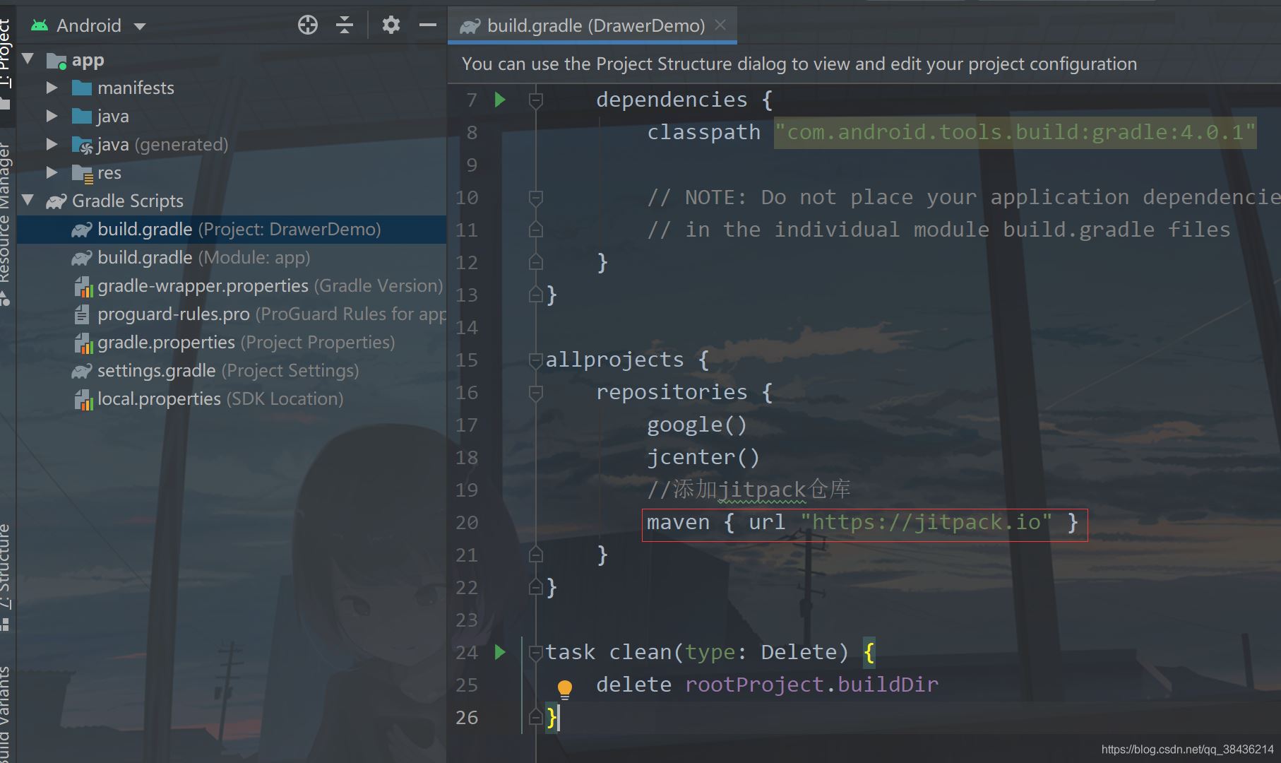
下面首先在工程的下build.gradle的添加如下
//添加jitpack倉庫 maven { url 'https://jitpack.io' }
添加位置如下圖:
為什么要這么做的呢?這里你就要分清楚Android依賴庫的由來,Google自己的庫和第三方庫。Google自己的庫在你創(chuàng)建項(xiàng)目時(shí)就已經(jīng)添加了,如
google() jcenter()
而第三方庫要想使用有些是需要添加jitpack倉庫的,也就是我上面添加的代碼。
下面進(jìn)入app的build.gradle,在dependencies閉包{}中添加如下依賴庫:
//RecyclerView最好的適配器,讓你的適配器一目了然,告別代碼冗余 implementation ’com.github.CymChad:BaseRecyclerViewAdapterHelper:2.9.30’ //Gson庫 implementation ’com.google.code.gson:gson:2.8.5’
然后再點(diǎn)擊Sync Now 進(jìn)行同步,同步?jīng)]有報(bào)錯(cuò),則我們先來構(gòu)建這個(gè)返回的數(shù)據(jù)。
{ 'code':200, 'data':[ { 'id':0, 'name':'朋友' }, { 'id':1, 'name':'錢包' }, { 'id':2, 'name':'位置' }, { 'id':3, 'name':'電話' }, { 'id':4, 'name':'郵箱' }, { 'id':5, 'name':'分享' }, { 'id':6, 'name':'發(fā)送' } ], 'msg':'Success'}
實(shí)際開發(fā)中的返回?cái)?shù)據(jù)和這個(gè)差不多,僅供參考。這一段JSON字符串,里面有三個(gè)主體內(nèi)容,code用來檢測(cè)你返回的是否合格,通常200表示正常返回,msg則表示描述,對(duì)于這個(gè)code的描述。data則是返回的數(shù)據(jù)組數(shù)。下面通過這個(gè)返回?cái)?shù)據(jù),我們可以寫出這樣的一個(gè)實(shí)體類。在com.llw.drawerdemo中新建一個(gè)MenuResponse.java類,里面的代碼如下:
package com.llw.drawerdemo;import java.util.List;/** * 菜單返回?cái)?shù)據(jù) * @author lonel */public class MenuResponse { /** * code : 200 * data : [{'id':0,'name':'朋友'},{'id':1,'name':'錢包'},{'id':2,'name':'位置'},{'id':3,'name':'電話'},{'id':4,'name':'郵箱'},{'id':5,'name':'分享'},{'id':6,'name':'發(fā)送'}] * msg : Success */ private int code; private String msg; private List<DataBean> data; public int getCode() { return code; } public void setCode(int code) { this.code = code; } public String getMsg() { return msg; } public void setMsg(String msg) { this.msg = msg; } public List<DataBean> getData() { return data; } public void setData(List<DataBean> data) { this.data = data; } public static class DataBean { /** * id : 0 * name : 朋友 */ private int id; private String name; public int getId() { return id; } public void setId(int id) { this.id = id; } public String getName() { return name; } public void setName(String name) { this.name = name; } }}
然后再創(chuàng)建一個(gè)常量類Contanst.java,里面的代碼如下:
package com.llw.drawerdemo;/** * 常量 * @author lonel */public class Contanst { public static final int SUCCESS = 200; public static final String JSON = '{n' + ' 'code':200,n' + ' 'data':[n' + ' {n' + ' 'id':0,n' + ' 'name':'朋友'n' + ' },n' + ' {n' + ' 'id':1,n' + ' 'name':'錢包'n' + ' },n' + ' {n' + ' 'id':2,n' + ' 'name':'位置'n' + ' },n' + ' {n' + ' 'id':3,n' + ' 'name':'電話'n' + ' },n' + ' {n' + ' 'id':4,n' + ' 'name':'郵箱'n' + ' },n' + ' {n' + ' 'id':5,n' + ' 'name':'分享'n' + ' },n' + ' {n' + ' 'id':6,n' + ' 'name':'發(fā)送'n' + ' }n' + ' n' + ' ],n' + ' 'msg':'Success'n' + '}';}
里面是我們返回的數(shù)據(jù)JSON字符串,用這種方式來模擬真實(shí)返回?cái)?shù)據(jù)。還有一點(diǎn)就是這個(gè)成功碼用一個(gè)全局的常量來表示,盡量不要再代碼中直接使用200來做為成功的返回判定。用常量的好處就是改起來快,假如今天你是200為成功,明天變成100,那么我只需要改這個(gè)常量的值即可,而不需要你去每一個(gè)用200判定的地方都去手動(dòng)改成100,效率上就提高很多。
下面來寫這個(gè)item的布局,在layout下新建一個(gè)item_menu.xml文件,里面的代碼如下:
<?xml version='1.0' encoding='utf-8'?><TextView xmlns:android='http://schemas.android.com/apk/res/android' android: android:layout_width='match_parent' android:layout_height='wrap_content' android:foreground='?attr/selectableItemBackground' android:padding='16dp' android:textColor='#000' android:textSize='16sp' />
這里的
android:foreground='?attr/selectableItemBackground'
就是點(diǎn)擊item的效果,體驗(yàn)感更強(qiáng)一些。
然后去寫適配器,在com.llw.drawerdemo下新建一個(gè)MenuAdapter類,里面的代碼如下:
package com.llw.drawerdemo;import androidx.annotation.Nullable;import com.chad.library.adapter.base.BaseQuickAdapter;import com.chad.library.adapter.base.BaseViewHolder;import java.util.List;/** * 菜單列表適配器 * @author lonel */public class MenuAdapter extends BaseQuickAdapter<MenuResponse.DataBean, BaseViewHolder> { public MenuAdapter(int layoutResId, @Nullable List<MenuResponse.DataBean> data) { super(layoutResId, data); } @Override protected void convert(BaseViewHolder helper, MenuResponse.DataBean item) { helper.setText(R.id.tv_menu_name,item.getName()); //添加點(diǎn)擊事件 helper.addOnClickListener(R.id.tv_menu_name); }}
相比于傳統(tǒng)的適配器,這樣寫就簡(jiǎn)潔很多了,然后是修改布局,首先是activity_main.xml中,我們?nèi)サ鬾av_menu
保留這個(gè)headerLayout,然后去修改這個(gè)nav_header布局代碼:修改后如下:
<?xml version='1.0' encoding='utf-8'?><androidx.core.widget.NestedScrollView xmlns:android='http://schemas.android.com/apk/res/android' xmlns:app='http://schemas.android.com/apk/res-auto' android:layout_width='match_parent' android:layout_height='match_parent' android:fitsSystemWindows='true' android:overScrollMode='never' android:orientation='vertical'> <LinearLayout android:orientation='vertical' android:layout_width='match_parent' android:layout_height='wrap_content'> <!--頭部菜單--> <RelativeLayout android:background='#1391F8' android:layout_width='match_parent' android:layout_height='160dp'> <!--頭像--> <com.google.android.material.imageview.ShapeableImageView android: android:layout_width='80dp' android:layout_height='80dp' android:layout_alignParentBottom='true' android:layout_marginStart='24dp' android:layout_marginEnd='24dp' android:layout_marginBottom='30dp' android:padding='1dp' android:src='http://m.4tl426be.cn/bcjs/@mipmap/icon_default_avatar' app:shapeAppearanceOverlay='@style/circleImageStyle' app:strokeColor='#FFF' app:strokeWidth='2dp' /> <!--名稱--> <TextView android: android:layout_width='wrap_content' android:layout_height='wrap_content' android:layout_alignTop='@+id/iv_avatar' android:layout_marginTop='16dp' android:layout_toEndOf='@+id/iv_avatar' android:text='初學(xué)者-Study' android:textColor='#FFF' android:textSize='16sp' /> <!--標(biāo)簽--> <TextView android: android:layout_width='wrap_content' android:layout_height='wrap_content' android:layout_below='@+id/tv_name' android:layout_marginTop='8dp' android:layout_toEndOf='@+id/iv_avatar' android:text='Android | Java' android:textColor='#FFF' android:textSize='14sp' /> </RelativeLayout> <!--列表菜單--> <androidx.recyclerview.widget.RecyclerView android: android:layout_width='match_parent' android:layout_height='wrap_content'/> </LinearLayout></androidx.core.widget.NestedScrollView>
NestedScrollView表示一個(gè)滾動(dòng)視圖,它里面只能放一個(gè)布局,當(dāng)這個(gè)布局的高度超過屏幕時(shí),則可以上下滾動(dòng)顯示,而這個(gè)布局里面又可以嵌套其他的布局。我在里面放置了之前的相對(duì)布局和新增的列表控件。下面我們進(jìn)入到MainActivity。
先聲明成員變量
private RecyclerView rvMenu;//列表
然后在onCreate中通過headerView去綁定布局中的id。
//綁定列表控件 rvMenu = headerView.findViewById(R.id.rv_menu);
然后再寫一個(gè)方法用來顯示菜單列表。
/** * 顯示菜單列表 */ private void showMenuList() { //解析JSON數(shù)據(jù) MenuResponse menuResponse = new Gson().fromJson(Contanst.JSON, MenuResponse.class); if (menuResponse.getCode() == Contanst.SUCCESS) { //為空處理 if(menuResponse.getData() ==null){ showMsg('返回菜單數(shù)據(jù)為空'); return; } List<MenuResponse.DataBean> data = menuResponse.getData(); //設(shè)置適配器的布局和數(shù)據(jù)源 MenuAdapter menuAdapter = new MenuAdapter(R.layout.item_menu, data); //item點(diǎn)擊事件 menuAdapter.setOnItemChildClickListener((adapter, view, position) -> { showMsg(data.get(position).getName()); //關(guān)閉滑動(dòng)菜單 drawerLayout.closeDrawer(GravityCompat.START); }); //設(shè)置線性布局管理器,默認(rèn)是縱向 rvMenu.setLayoutManager(new LinearLayoutManager(this)); //設(shè)置適配器 rvMenu.setAdapter(menuAdapter); } else { //錯(cuò)誤提示 showMsg(menuResponse.getMsg()); } }
里面的代碼都有注釋,相信你一定可以看懂。
然后在onCreate中調(diào)用這個(gè)方法
運(yùn)行。
效果是有了,但是好像沒有圖標(biāo)有點(diǎn)不得勁是吧。因?yàn)閷?shí)際開發(fā)中的圖標(biāo)也是從后臺(tái)返回過來的,一般來說是一個(gè)網(wǎng)絡(luò)圖標(biāo)地址,這個(gè)地址你可以通過Glide庫去進(jìn)行圖標(biāo)顯示。而我們沒有這個(gè)網(wǎng)絡(luò)地址,不過幸運(yùn)的是,我們有之前手寫的七個(gè)圖標(biāo),不是嗎。我們將這七個(gè)圖標(biāo)組成一個(gè)int數(shù)組,然后在適配器中進(jìn)行配置就好了,不過首先呢需要改變一下item_menu.xml。
<?xml version='1.0' encoding='utf-8'?><LinearLayout xmlns:android='http://schemas.android.com/apk/res/android' android: android:layout_width='match_parent' android:layout_height='wrap_content' android:foreground='?attr/selectableItemBackground' android:gravity='center_vertical' android:orientation='horizontal' android:paddingStart='16dp'> <!--菜單圖標(biāo)--> <ImageView android: android:layout_width='24dp' android:layout_height='24dp' /> <!--菜單名稱--> <TextView android:layout_marginStart='16dp' android: android:layout_width='match_parent' android:layout_height='wrap_content' android:padding='16dp' android:textColor='#000' android:textSize='16sp' /></LinearLayout>
然后進(jìn)入MenuAdapter中,新增一個(gè)圖標(biāo)數(shù)組
private int[] iconArray = {R.drawable.icon_friend, R.drawable.icon_wallet, R.drawable.icon_location , R.drawable.icon_phone, R.drawable.icon_email, R.drawable.icon_share, R.drawable.icon_send};
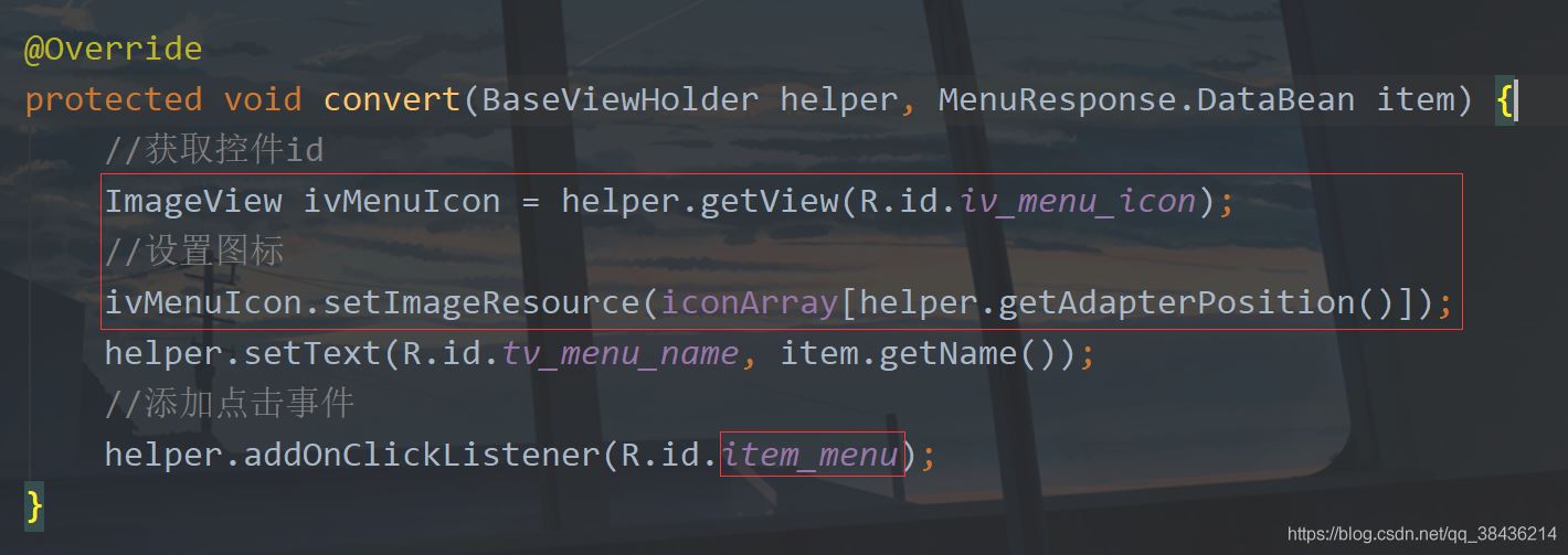
然后在convert中通過item的位置來獲取圖標(biāo)數(shù)組中的圖標(biāo),然后設(shè)置到ImageVIew中,這樣寫是有弊端的,當(dāng)你的數(shù)據(jù)條目和圖標(biāo)數(shù)組長(zhǎng)度不一致時(shí),就會(huì)出現(xiàn)數(shù)組越界,然后就報(bào)錯(cuò)崩潰,程序閃退,因此實(shí)際中不會(huì)采取這種方式,我這里只是演示。其次我還改變了添加點(diǎn)擊事件的圖標(biāo),之前是給TextView添加點(diǎn)擊事件,現(xiàn)在是給LinearLayout添加點(diǎn)擊事件。
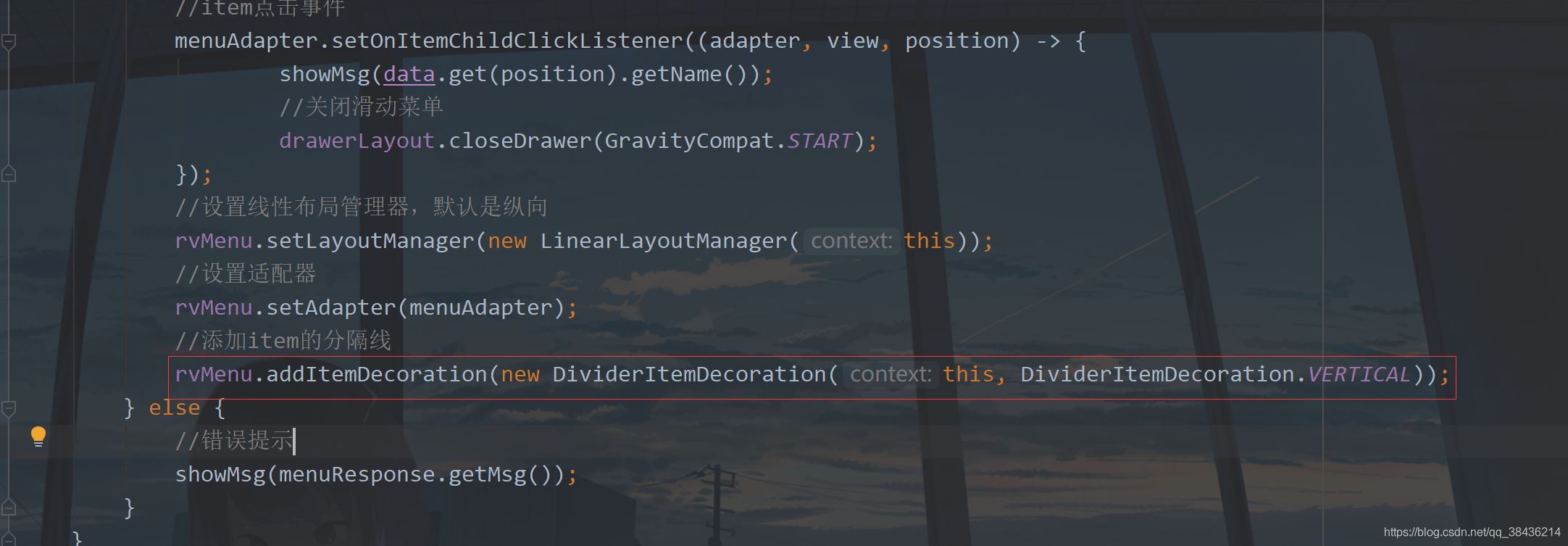
然后我們回到MainActivity中,去給item添加分割線。
//添加item的分隔線 rvMenu.addItemDecoration(new DividerItemDecoration(this, DividerItemDecoration.VERTICAL));
添加位置如下:
下面再運(yùn)行一次。

這里菜單圖標(biāo)有了,分割線也有了,不過實(shí)際為了美感,通常會(huì)去掉最后一個(gè)item的分隔線,這個(gè)可以通過自定義View來實(shí)現(xiàn),網(wǎng)上多的是。繼承RecyclerView.ItemDecoration然后獲取item數(shù)量,最后一個(gè)item不繪制分割線。
我這里就不詳細(xì)介紹這種方式了,我們可以用另一種巧妙的方式來解決:添加靜態(tài)菜單。
下面再添加兩個(gè)圖標(biāo),item_setting.xml
<?xml version='1.0' encoding='UTF-8'?><vector xmlns:android='http://schemas.android.com/apk/res/android' android: android: android:tint='#000000' android:viewportWidth='24.0' android:viewportHeight='24.0'> <path android:fillColor='@android:color/white' android:pathData='M18.04,7.99l-0.63,-1.4l-1.4,-0.63c-0.39,-0.18 -0.39,-0.73 0,-0.91l1.4,-0.63l0.63,-1.4c0.18,-0.39 0.73,-0.39 0.91,0l0.63,1.4l1.4,0.63c0.39,0.18 0.39,0.73 0,0.91l-1.4,0.63l-0.63,1.4C18.78,8.38 18.22,8.38 18.04,7.99zM21.28,12.72L20.96,12c-0.18,-0.39 -0.73,-0.39 -0.91,0l-0.32,0.72L19,13.04c-0.39,0.18 -0.39,0.73 0,0.91l0.72,0.32L20.04,15c0.18,0.39 0.73,0.39 0.91,0l0.32,-0.72L22,13.96c0.39,-0.18 0.39,-0.73 0,-0.91L21.28,12.72zM16.24,14.37l1.23,0.93c0.4,0.3 0.51,0.86 0.26,1.3l-1.62,2.8c-0.25,0.44 -0.79,0.62 -1.25,0.42l-1.43,-0.6c-0.2,0.13 -0.42,0.26 -0.64,0.37l-0.19,1.54c-0.06,0.5 -0.49,0.88 -0.99,0.88H8.38c-0.5,0 -0.93,-0.38 -0.99,-0.88L7.2,19.59c-0.22,-0.11 -0.43,-0.23 -0.64,-0.37l-1.43,0.6c-0.46,0.2 -1,0.02 -1.25,-0.42l-1.62,-2.8c-0.25,-0.44 -0.14,-0.99 0.26,-1.3l1.23,-0.93C3.75,14.25 3.75,14.12 3.75,14s0,-0.25 0.01,-0.37L2.53,12.7c-0.4,-0.3 -0.51,-0.86 -0.26,-1.3l1.62,-2.8c0.25,-0.44 0.79,-0.62 1.25,-0.42l1.43,0.6c0.2,-0.13 0.42,-0.26 0.64,-0.37l0.19,-1.54C7.45,6.38 7.88,6 8.38,6h3.23c0.5,0 0.93,0.38 0.99,0.88l0.19,1.54c0.22,0.11 0.43,0.23 0.64,0.37l1.43,-0.6c0.46,-0.2 1,-0.02 1.25,0.42l1.62,2.8c0.25,0.44 0.14,0.99 -0.26,1.3l-1.23,0.93c0.01,0.12 0.01,0.24 0.01,0.37S16.25,14.25 16.24,14.37zM13,14c0,-1.66 -1.34,-3 -3,-3s-3,1.34 -3,3s1.34,3 3,3S13,15.66 13,14z' /></vector>
icon_logout.xml
<?xml version='1.0' encoding='UTF-8'?><vector xmlns:android='http://schemas.android.com/apk/res/android' android: android: android:autoMirrored='true' android:tint='#000000' android:viewportWidth='24.0' android:viewportHeight='24.0'> <path android:fillColor='@android:color/white' android:pathData='M5,5h6c0.55,0 1,-0.45 1,-1v0c0,-0.55 -0.45,-1 -1,-1H5C3.9,3 3,3.9 3,5v14c0,1.1 0.9,2 2,2h6c0.55,0 1,-0.45 1,-1v0c0,-0.55 -0.45,-1 -1,-1H5V5z' /> <path android:fillColor='@android:color/white' android:pathData='M20.65,11.65l-2.79,-2.79C17.54,8.54 17,8.76 17,9.21V11h-7c-0.55,0 -1,0.45 -1,1v0c0,0.55 0.45,1 1,1h7v1.79c0,0.45 0.54,0.67 0.85,0.35l2.79,-2.79C20.84,12.16 20.84,11.84 20.65,11.65z' /></vector>
然后修改之前的nav_menu.xml,修改后如下:
<?xml version='1.0' encoding='utf-8'?><menu xmlns:android='http://schemas.android.com/apk/res/android'> <!--增加其他菜單--> <item android:title='其他'> <menu> <item android: android:icon='@drawable/icon_settings' android:title='設(shè)置' /> <item android: android:icon='@drawable/icon_logout' android:title='退出' /> </menu> </item></menu>
然后在styles.xml中增加一個(gè)item字體的大小設(shè)置
<!--menu文字樣式--><style name='MenuTextStyle'> <item name='android:textSize'>16sp</item> </style>
再進(jìn)入activity_main.xml,修改NavigationView,修改內(nèi)容如下:
<!--滑動(dòng)導(dǎo)航視圖--> <com.google.android.material.navigation.NavigationView android: android:layout_width='match_parent' android:layout_height='match_parent' android:layout_gravity='start' android:theme='@style/MenuTextStyle' app:headerLayout='@layout/nav_header' app:itemIconSize='24dp' app:itemIconTint='#000' app:itemTextColor='#000' app:menu='@menu/nav_menu' />
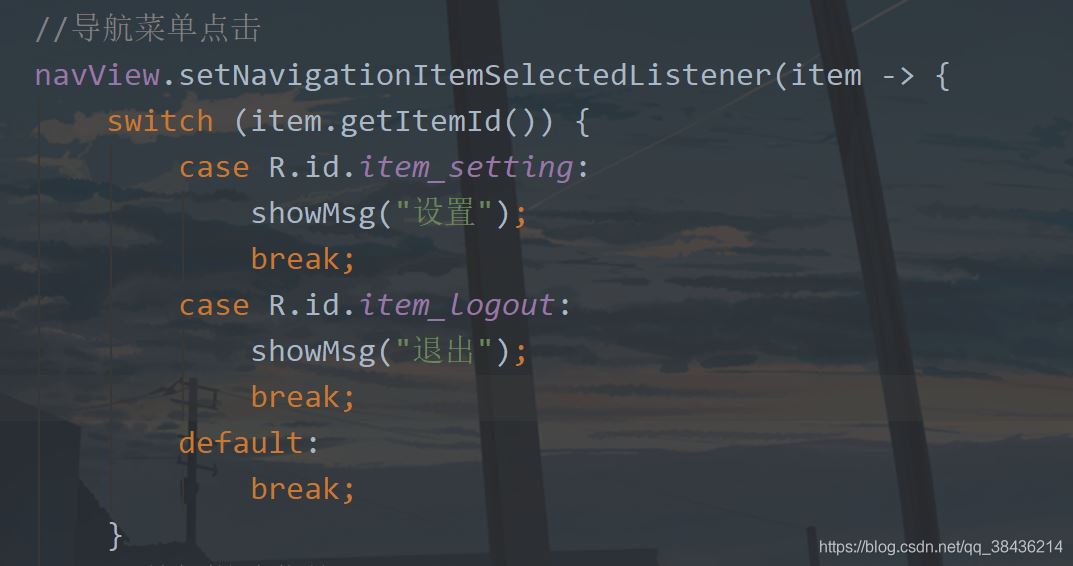
再進(jìn)入MainActivity中,修改菜單點(diǎn)擊事件
然后運(yùn)行一下:
嗯,這樣你現(xiàn)在動(dòng)態(tài)也有靜態(tài)也有,挺好的,本文就寫到這里了。
上高水長(zhǎng),后會(huì)有期。
七、源碼源碼地址:DrawerDemo
到此這篇關(guān)于Android 側(cè)滑抽屜菜單的實(shí)現(xiàn)代碼的文章就介紹到這了,更多相關(guān)Android 側(cè)滑抽屜菜單內(nèi)容請(qǐng)搜索好吧啦網(wǎng)以前的文章或繼續(xù)瀏覽下面的相關(guān)文章希望大家以后多多支持好吧啦網(wǎng)!
相關(guān)文章:
1. 完美解決vue 中多個(gè)echarts圖表自適應(yīng)的問題2. JAMon(Java Application Monitor)備忘記3. 利用CSS制作3D動(dòng)畫4. Java GZip 基于內(nèi)存實(shí)現(xiàn)壓縮和解壓的方法5. jsp+servlet簡(jiǎn)單實(shí)現(xiàn)上傳文件功能(保存目錄改進(jìn))6. idea配置jdk的操作方法7. SpringBoot+TestNG單元測(cè)試的實(shí)現(xiàn)8. Springboot 全局日期格式化處理的實(shí)現(xiàn)9. 存儲(chǔ)于xml中需要的HTML轉(zhuǎn)義代碼10. idea打開多個(gè)窗口的操作方法

 網(wǎng)公網(wǎng)安備