Python 數(shù)據(jù)科學(xué) Matplotlib圖庫詳解
Matplotlib 是 Python 的二維繪圖庫,用于生成符合出版質(zhì)量或跨平臺交互環(huán)境的各類圖形。
圖形解析與工作流圖形解析
工作流
Matplotlib 繪圖的基本步驟:1 準(zhǔn)備數(shù)據(jù)
2 創(chuàng)建圖形
3 繪圖
4 自定義設(shè)置
5 保存圖形
6 顯示圖形
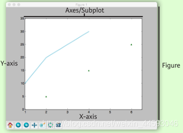
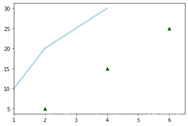
import matplotlib.pyplot as pltx = [1,2,3,4] # step1y = [10,20,25,30]fig = plt.figure() # step2ax = fig.add_subplot(111) # step3ax.plot(x, y, color=’lightblue’, linewidth=3) # step34ax.scatter([2,4,6], [5,15,25], color=’darkgreen’, marker=’^’)ax.set_xlim(1, 6.5)plt.savefig(’foo.png’) # step5plt.show() # step6
一維數(shù)據(jù)
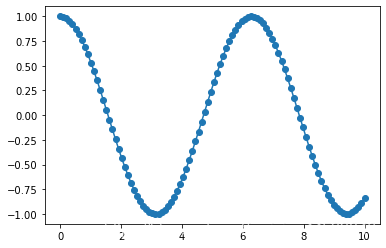
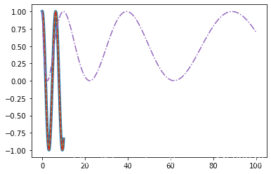
import numpy as np x = np.linspace(0, 10, 100)y = np.cos(x) z = np.sin(x)
二維數(shù)據(jù)或圖片
data = 2 * np.random.random((10, 10))data2 = 3 * np.random.random((10, 10))Y, X = np.mgrid[-3:3:100j, -3:3:100j]U = -1 - X**2 + YV = 1 + X - Y**2from matplotlib.cbook import get_sample_dataimg = np.load(’E:/anaconda3/envs/torch/Lib/site-packages/matplotlib/mpl-data/aapl.npz’)
繪制圖形
import matplotlib.pyplot as plt
畫布
fig = plt.figure()fig2 = plt.figure(figsize=plt.figaspect(2.0))
坐標(biāo)軸
圖形是以坐標(biāo)軸為核心繪制的,大多數(shù)情況下,子圖就可以滿足需求。子圖是柵格系統(tǒng)的坐標(biāo)軸。
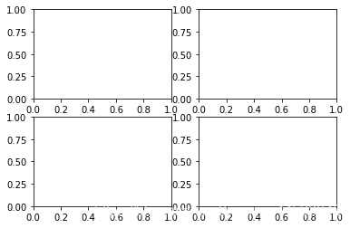
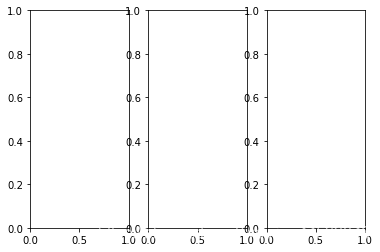
fig.add_axes()ax1 = fig.add_subplot(221) # row-col-numax3 = fig.add_subplot(212) fig3, axes = plt.subplots(nrows=2,ncols=2)fig4, axes2 = plt.subplots(ncols=3)
一維數(shù)據(jù)
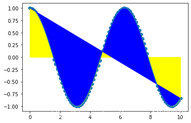
fig, ax = plt.subplots()lines = ax.plot(x,y) # 用線或標(biāo)記連接點(diǎn)ax.scatter(x,y) # 縮放或著色未連接的點(diǎn)axes[0,0].bar([1,2,3],[3,4,5]) # 繪制等寬縱向矩形axes[1,0].barh([0.5,1,2.5],[0,1,2]) # 繪制等高橫向矩形axes[1,1].axhline(0.45) # 繪制與軸平行的橫線axes[0,1].axvline(0.65) # 繪制與軸垂直的豎線ax.fill(x,y,color=’blue’) # 繪制填充多邊形ax.fill_between(x,y,color=’yellow’) # 填充y值和0之間
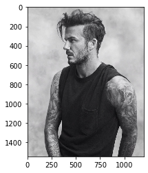
二維數(shù)據(jù)或圖片
import matplotlib.image as imgpltimg = imgplt.imread(’C:/Users/Administrator/Desktop/timg.jpg’) fig, ax = plt.subplots()im = ax.imshow(img, cmap=’gist_earth’, interpolation=’nearest’, vmin=-200, vmax=200)# 色彩表或RGB數(shù)組 axes2[0].pcolor(data2) # 二維數(shù)組偽彩色圖axes2[0].pcolormesh(data) # 二維數(shù)組等高線偽彩色圖CS = plt.contour(Y,X,U) # 等高線圖axes2[2].contourf(data) axes2[2]= ax.clabel(CS) # 等高線圖標(biāo)簽
向量場
axes[0,1].arrow(0,0,0.5,0.5) # 為坐標(biāo)軸添加箭頭axes[1,1].quiver(y,z) # 二維箭頭axes[0,1].streamplot(X,Y,U,V) # 二維箭頭
數(shù)據(jù)分布
ax1.hist(y) # 直方圖ax3.boxplot(y) # 箱形圖ax3.violinplot(z) # 小提琴圖
自定義圖形 顏色、色條與色彩表
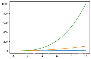
plt.plot(x, x, x, x**2, x, x**3)ax.plot(x, y, alpha = 0.4)ax.plot(x, y, c=’k’)fig.colorbar(im, orientation=’horizontal’)im = ax.imshow(img, cmap=’seismic’)
標(biāo)記
fig, ax = plt.subplots()ax.scatter(x,y,marker='.')ax.plot(x,y,marker='o')
線型
plt.plot(x,y,linewidth=4.0)plt.plot(x,y,ls=’solid’) plt.plot(x,y,ls=’--’)plt.plot(x,y,’--’,x**2,y**2,’-.’)plt.setp(lines,color=’r’,linewidth=4.0)
文本與標(biāo)注
ax.text(1, -2.1,’Example Graph’,style=’italic’)ax.annotate('Sine', xy=(8, 0), xycoords=’data’, xytext=(10.5, 0), textcoords=’data’, arrowprops=dict(arrowstyle='->', connectionstyle='arc3'),)
數(shù)學(xué)符號
plt.title(r’$sigma_i=15$’, fontsize=20)尺寸限制、圖例和布局
尺寸限制與自動調(diào)整
ax.margins(x=0.0,y=0.1) # 添加內(nèi)邊距ax.axis(’equal’) # 將圖形縱橫比設(shè)置為1ax.set(xlim=[0,10.5],ylim=[-1.5,1.5]) # 設(shè)置x軸與y軸的限ax.set_xlim(0,10.5)
圖例
ax.set(title=’An Example Axes’, ylabel=’Y-Axis’, xlabel=’X-Axis’) # 設(shè)置標(biāo)題與x、y軸的標(biāo)簽ax.legend(loc=’best’) # 自動選擇最佳的圖例位置
標(biāo)記
ax.xaxis.set(ticks=range(1,5), ticklabels=[3,100,-12,'foo']) # 手動設(shè)置X軸刻度ax.tick_params(axis=’y’, direction=’inout’, length=10) # 設(shè)置Y軸長度與方向
子圖間距
fig3.subplots_adjust(wspace=0.5, hspace=0.3, left=0.125, right=0.9, top=0.9, bottom=0.1)fig.tight_layout() # 設(shè)置畫布的子圖布局
坐標(biāo)軸邊線
ax1.spines[’top’].set_visible(False) # 隱藏頂部坐標(biāo)軸線ax1.spines[’bottom’].set_position((’outward’,10)) # 設(shè)置底部邊線的位置為outward
保存
#保存畫布plt.savefig(’foo.png’)# 保存透明畫布plt.savefig(’foo.png’, transparent=True)
顯示圖形
plt.show()
關(guān)閉與清除
plt.cla() # 清除坐標(biāo)軸plt.clf() # 清除畫布plt.close() # 關(guān)閉窗口
以上就是Python 數(shù)據(jù)科學(xué) Matplotlib的詳細(xì)內(nèi)容,更多關(guān)于Python 數(shù)據(jù)科學(xué) Matplotlib的資料請關(guān)注好吧啦網(wǎng)其它相關(guān)文章!
相關(guān)文章:
 網(wǎng)公網(wǎng)安備