python實現股票歷史數據可視化分析案例
投資有風險,選擇需謹慎。 股票交易數據分析可直觀股市走向,對于如何把握股票行情,快速解讀股票交易數據有不可替代的作用!
1 數據預處理1.1 股票歷史數據csv文件讀取import pandas as pdimport csv
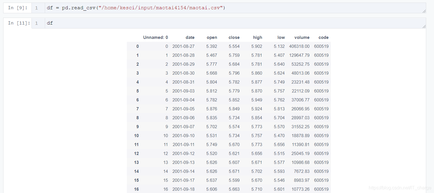
df = pd.read_csv('/home/kesci/input/maotai4154/maotai.csv')
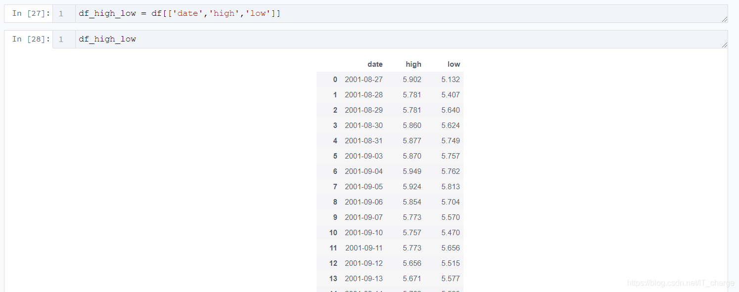
df_high_low = df[[’date’,’high’,’low’]]
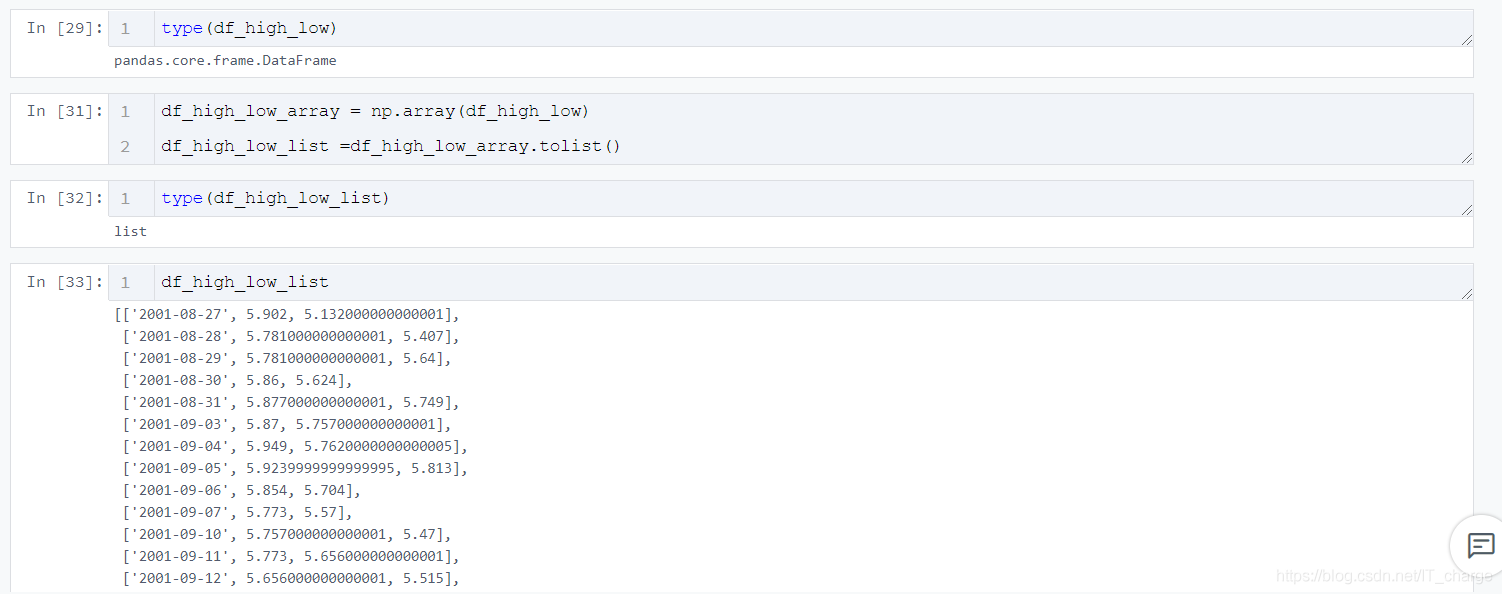
df_high_low_array = np.array(df_high_low)df_high_low_list =df_high_low_array.tolist()
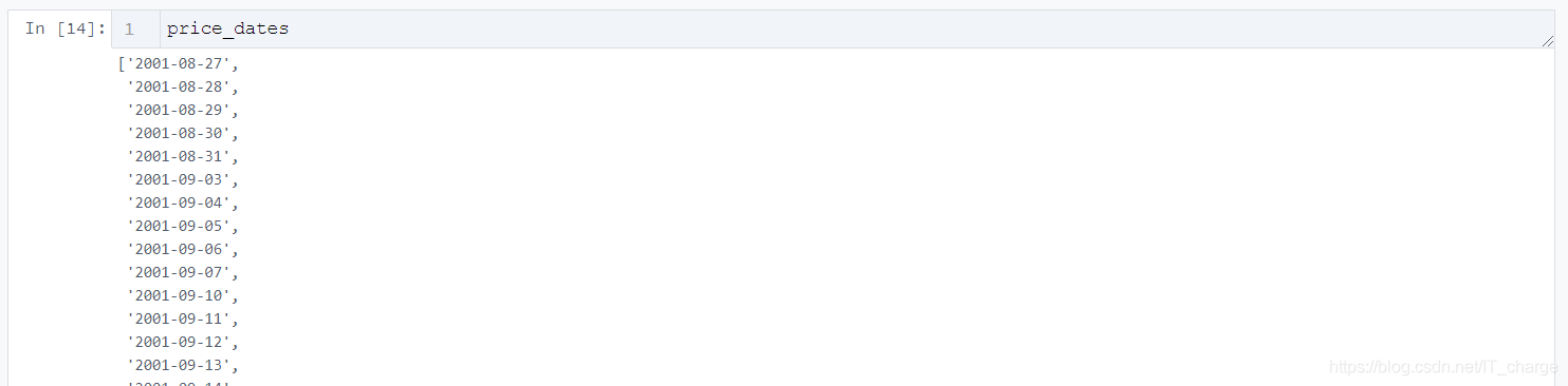
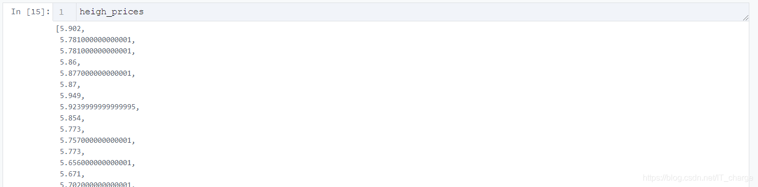
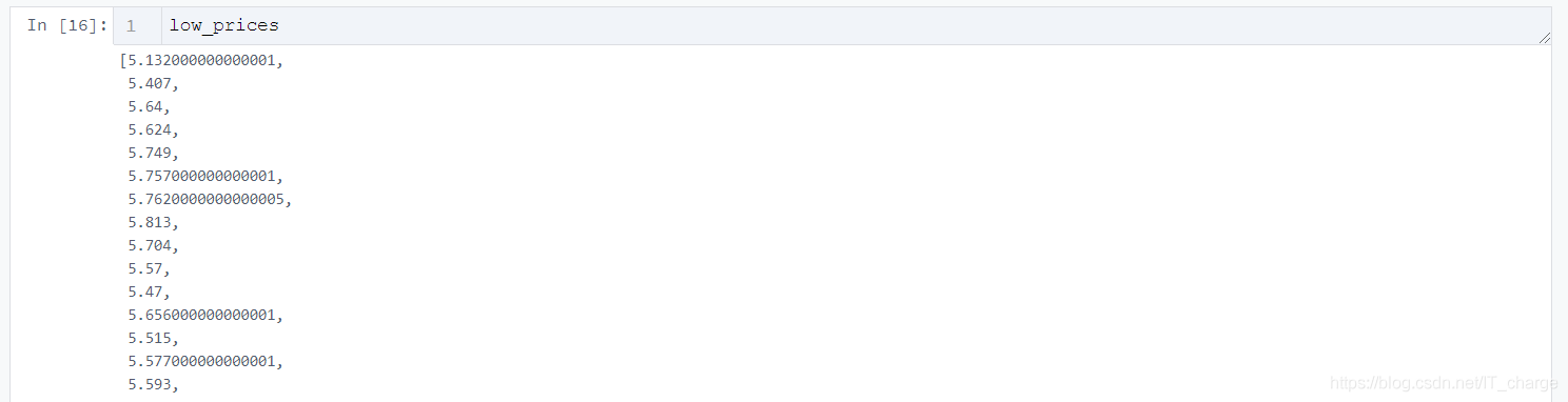
price_dates, heigh_prices, low_prices = [], [], []for content in zip(df_high_low_list): price_date = content[0][0] heigh_price = content[0][1] low_price = content[0][2] price_dates.append(price_date) heigh_prices.append(heigh_price) low_prices.append(low_price)
import pyecharts.options as optsfrom pyecharts.charts import Line2.2 初始化畫布
Line(init_opts=opts.InitOpts(width='1200px', height='600px'))2.3 根據需要傳入關鍵性數據并畫圖
.add_yaxis(series_name='最低價',y_axis=low_prices,markpoint_opts=opts.MarkPointOpts( data=[opts.MarkPointItem(value=-2, name='周最低', x=1, y=-1.5)]),markline_opts=opts.MarkLineOpts( data=[opts.MarkLineItem(type_='average', name='平均值'),opts.MarkLineItem(symbol='none', x='90%', y='max'),opts.MarkLineItem(symbol='circle', type_='max', name='最高點'), ]), )
tooltip_opts=opts.TooltipOpts(trigger='axis'),toolbox_opts=opts.ToolboxOpts(is_show=True),xaxis_opts=opts.AxisOpts(type_='category', boundary_gap=True)2.4 將生成的文件形成HTML代碼并下載
.render('HTML名字填這里.html')

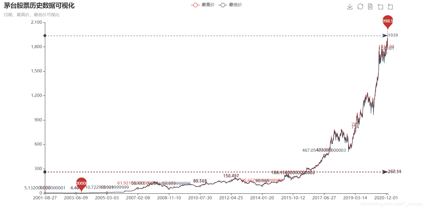
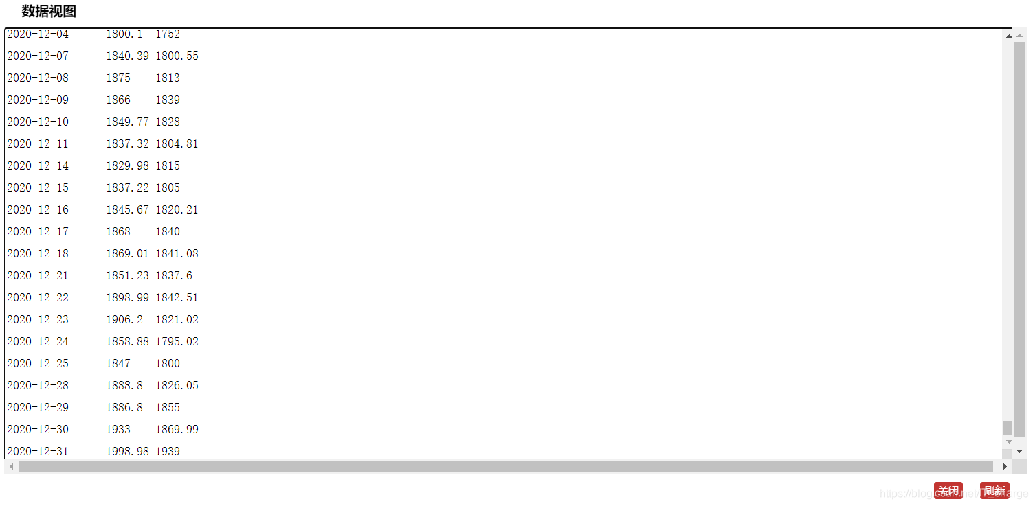
import pyecharts.options as optsfrom pyecharts.charts import Line ( Line(init_opts=opts.InitOpts(width='1200px', height='600px')) .add_xaxis(xaxis_data=price_dates) .add_yaxis(series_name='最高價',y_axis=heigh_prices,markpoint_opts=opts.MarkPointOpts( data=[opts.MarkPointItem(type_='max', name='最大值'),opts.MarkPointItem(type_='min', name='最小值'), ]),markline_opts=opts.MarkLineOpts( data=[opts.MarkLineItem(type_='average', name='平均值')]), ) .add_yaxis(series_name='最低價',y_axis=low_prices,markpoint_opts=opts.MarkPointOpts( data=[opts.MarkPointItem(value=-2, name='周最低', x=1, y=-1.5)]),markline_opts=opts.MarkLineOpts( data=[opts.MarkLineItem(type_='average', name='平均值'),opts.MarkLineItem(symbol='none', x='90%', y='max'),opts.MarkLineItem(symbol='circle', type_='max', name='最高點'), ]), ) .set_global_opts(title_opts=opts.TitleOpts(title='茅臺股票歷史數據可視化', subtitle='日期、最高價、最低價可視化'),tooltip_opts=opts.TooltipOpts(trigger='axis'),toolbox_opts=opts.ToolboxOpts(is_show=True),xaxis_opts=opts.AxisOpts(type_='category', boundary_gap=True), ) .render('everyDayPrice_change_line_chart2.html'))3 結果展示

到此這篇關于python實現股票歷史數據可視化分析案例的文章就介紹到這了,更多相關python股票數據可視化內容請搜索好吧啦網以前的文章或繼續瀏覽下面的相關文章希望大家以后多多支持好吧啦網!
相關文章:
1. Python獲取抖音關注列表封號賬號的實現代碼2. Warning: require(): open_basedir restriction in effect,目錄配置open_basedir報錯問題分析3. php網絡安全中命令執行漏洞的產生及本質探究4. 解決Python 進程池Pool中一些坑5. php測試程序運行速度和頁面執行速度的代碼6. Python如何讀寫CSV文件7. 三個不常見的 HTML5 實用新特性簡介8. ajax請求添加自定義header參數代碼9. python利用os模塊編寫文件復制功能——copy()函數用法10. 無線標記語言(WML)基礎之WMLScript 基礎第1/2頁
 網公網安備
網公網安備