css3 - 這種情景怎么解釋?display:flex 遭遇 white-space: nowrap;
問題描述
html如下,使用了flex-box布局,左邊圖片的img-box定寬,右邊的css定義了flex-item,然后對shop-name進行了單行不換行截斷,這時候就發(fā)現(xiàn)左邊的圖片被擠扁了,小于定的寬度。發(fā)生這個情況在chrome上,ios和安卓的微信下正常.
chrome效果見圖: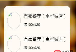
<a href='http://m.4tl426be.cn/wenda/5874.html#' class='coupons-item flex'> <p class='img-box'><img src='http://m.4tl426be.cn/wenda/1.jpg' /></p> <p class='flex-item'><h3 class='shop-name'>有家餐廳(京華城店)</h3><p class='text'>滿100減20</p> </p></a>
(scss)
.coupons-item{ padding:1rem; color:#000; text-decoration: none; border-bottom:1px solid $gray-border-color; .img-box{ width:6rem; height:6rem; margin-right:1rem; @include radius(50%); overflow: hidden; img{ display: block; width:100%; height:100%; @include radius(50%); } } .shop-name{ line-height:2; height:3.6rem; font-weight:normal; font-size:1.8rem; overflow: hidden; -ms-text-overflow: ellipsis; text-overflow: ellipsis; white-space: nowrap; } .text{ font-size:1.4rem; }}
問題解答
回答1:之前遇到過,解決辦法:首先.flex-item設(shè)置下最小寬度
min-width:0
然后.shopname設(shè)置下寬度
width:100%回答2:
shop-name定義寬度浮動試下
回答3:給.shop-name設(shè)一個最大寬度試試吧
相關(guān)文章:
1. angular.js - webpack build后的angularjs路由跳轉(zhuǎn)問題2. java - Activity中的成員變量被賦值之后,Activity被回收的時候內(nèi)存才會被釋放嗎3. java - web項目中,用戶登陸信息存儲在session中好 還是cookie中好,取決于什么?4. php由5.3升級到5.6后,登錄網(wǎng)站,返回的是php代碼,不是登錄界面,各位大神有知道的嗎?5. 數(shù)組按鍵值封裝!6. 我寫的哪里有錯?請大神幫忙查看一下。7. tp5.0,param獲取全部參數(shù)8. 使用list和each配合,的作業(yè),輸出一行后,如何換行9. 老師,flex-shrink: 1; 按視頻操作,不會自動縮放10. 為什么 必須在<ul> 下建立 <li> 在建<a>?

 網(wǎng)公網(wǎng)安備