html - 一道簡(jiǎn)單CSS的面試題
問題描述
今天剛剛碰到的 hr要求一個(gè)半小時(shí)完成
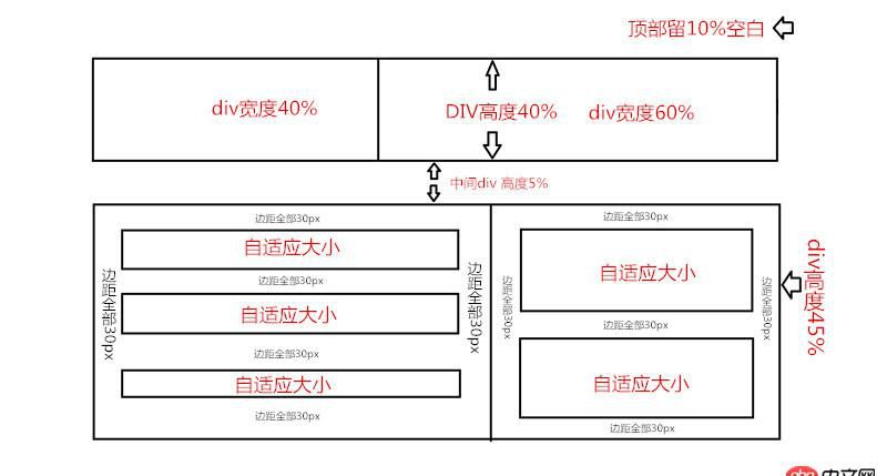
要求p自適應(yīng)大小
邊距都是30px,剩下的p全部自適應(yīng)屏幕 如果有根據(jù)屏幕大小自動(dòng)變化CSS樣式的更好
要求已經(jīng)寫在圖上了 有沒有萌新前來練手
問題解答
回答1:<style type='text/css'><!-- html,body {height: 100%; } body, body * {margin: 0;padding: 0; } p {box-sizing: border-box;-webkit-box-sizing: border-box;border: 1px solid #333; } .header_left, .header_right {height: 40%;float: left;margin-top: 10%; } .header_left {width: 40%; } .header_right {width: 60%;border-left-style: none; } .clear {clear: both;border: none; } .main {margin-top: 5%;height: 45%;color: red;text-align: center; } .main_left, .main_right {float: left;width: 60%;height: 100%;border: none; } .main_right {width: 40%;border-left: 1px solid #333; }.main_left_top,.main_left_middle,.main_left_bottom,.main_right_top,.main_right_bottom { margin: 30px;}--></style> <p class='header_left'></p><p class='header_right'></p><p class='clear'></p> <p class='main'><p class='main_left'><p class='main_left_top'>隨著內(nèi)容適應(yīng)大小</p><p class='main_left_top'>隨著內(nèi)容適應(yīng)大小</p><p class='main_left_bottom'>隨著內(nèi)容適應(yīng)大小</p> </p><p class='main_right'><p class='main_right_top'>隨著內(nèi)容適應(yīng)大小</p><p class='main_right_bottom'>隨著內(nèi)容適應(yīng)大小</p></p><p class='clear'></p> </p>回答2:
有2種方法實(shí)現(xiàn)一種是float,一種是flex,不過可能flex的兼容性不太好float布局
flex布局
回答3:這個(gè)問題不難啊,我會(huì),分分鐘搞定
回答4:圖已經(jīng)寫得很詳細(xì)了,只要根據(jù)圖寫出相應(yīng)的布局就OK了。如果還是迷茫的,建議你從鞏固一下p布局。
回答5:挺簡(jiǎn)單的,只是自適應(yīng)不是響應(yīng)式,都標(biāo)著百分比了
相關(guān)文章:
1. html5 - ElementUI table中el-table-column怎么設(shè)置百分比顯示。2. python - 使用readlines()方法讀取文件內(nèi)容后,再用for循環(huán)遍歷文件與變量匹配時(shí)出現(xiàn)疑難?3. 對(duì)mysql某個(gè)字段監(jiān)控的功能4. css3 - less或者scss 顏色計(jì)算的知識(shí)應(yīng)該怎么學(xué)?或者在哪里學(xué)?5. 注冊(cè)賬戶文字不能左右分離6. javascript - table列過多,有什么插件可以提供列排序和選擇顯示列的功能7. css - 網(wǎng)頁div區(qū)塊 像蘋果一樣可左右滑動(dòng) 手機(jī)與電腦8. javascript - 數(shù)組的過濾和渲染9. html - vue項(xiàng)目中用到了elementUI問題10. JavaScript事件
 網(wǎng)公網(wǎng)安備